
Gain insights into variable relationships and their impact on outcomes with an influence matrix
Table of contents
Add an Influence Matrix to your Dashboards
Go to Analysis tab > Dashboards > Create/Edit a Dashboard
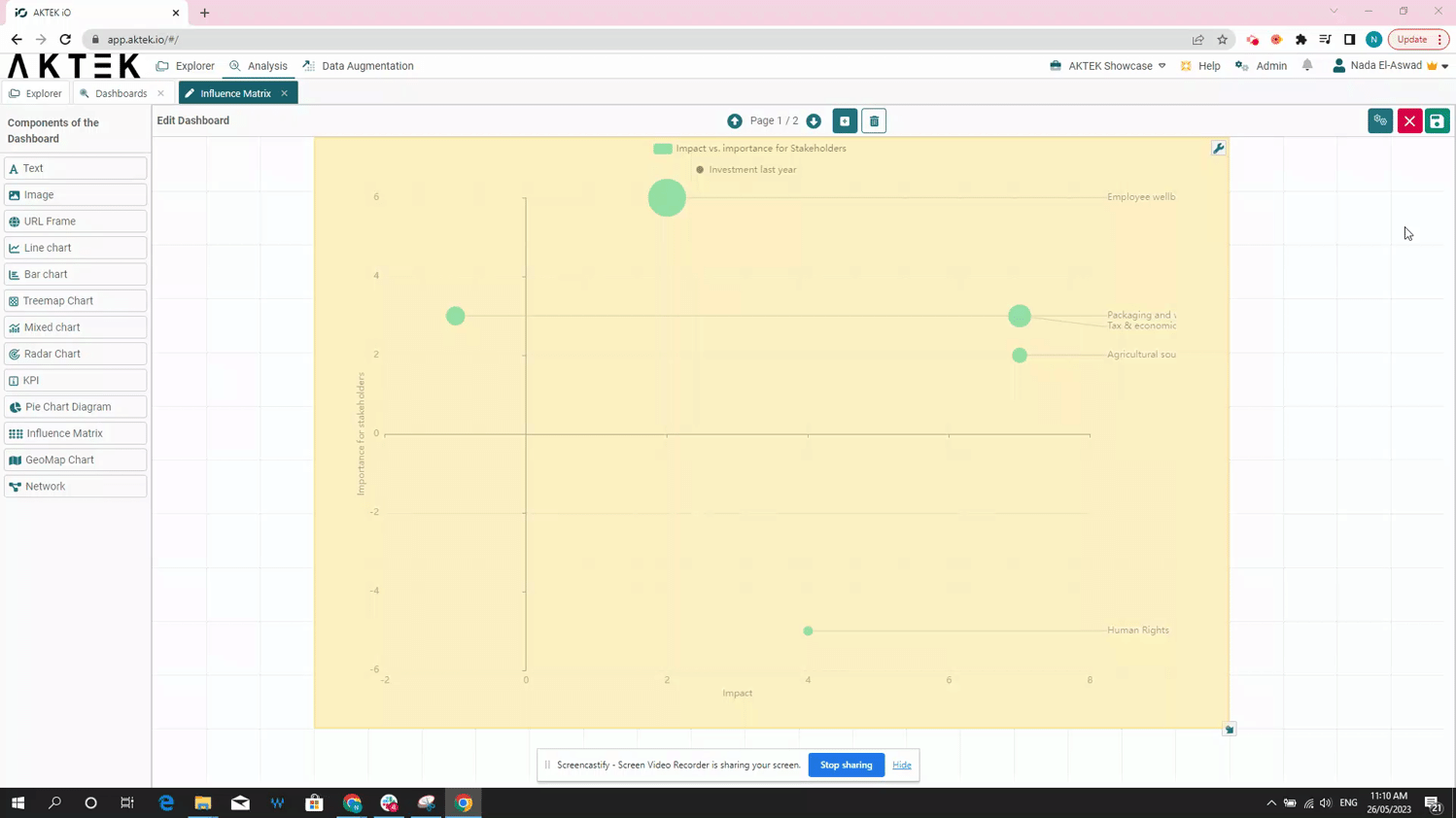
- An Influence Matrix in AKTEK iO consists of a general title, a dimension, measure(s), split data function, and appearance. In this example, we will build one to show which issues rank where on impact (X, dimension), importance (Y, measure), and investment (Z, size).
- Select Add a measure in order to add the numerical fields, you want to use for each of your matrix axes. In this case, we selected the Relevant Issues Analysis table. You can also add additional measures with a different combination of variables and select colors for your bubbles using the Measure Color option.
-
To edit, simply click Edit again on the top right and right-click over your Influence Matrix.
-
Hover over the chart to reveal the Full-screen icon in the top right corner of the chart. It will open in full screen for a better display during the presentation. Click on the X button to return to normal view.
💡 After you Save the dashboard, you can right-click on the chart to download it. It will save this chart as an image on your machine.
⚠️ In order to create an influence matrix, you need to have a report with at least two number fields.
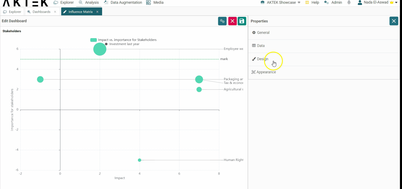
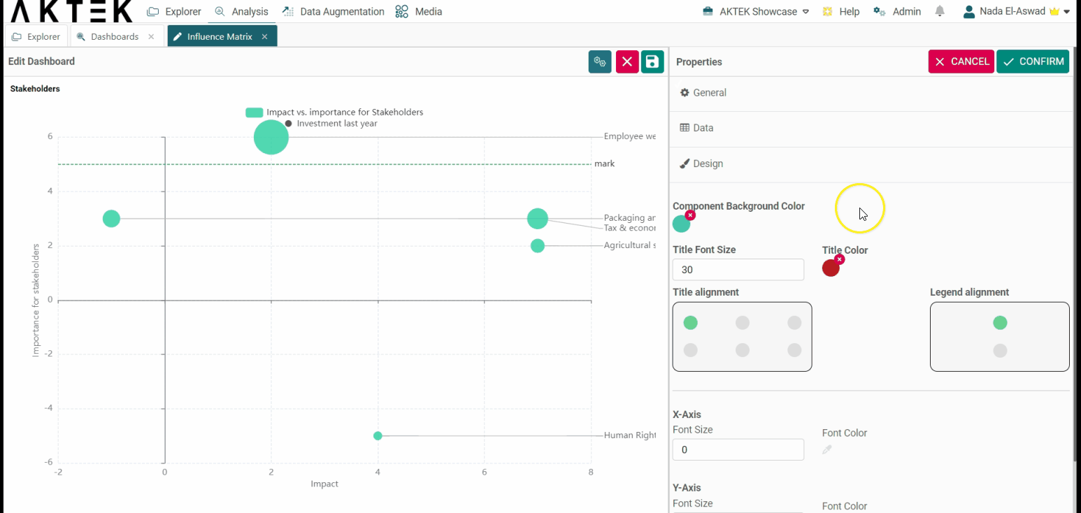
Design
- Component background color: Leave it unselected if you want a white background. You can also set the default color from the Company settings > Branding theme > Charts Background Color.
- Title font size and Title color: Edit the default size (12) and the default color (black).
-
Title alignment: You can choose one of the six positions (top left, top center, top right, bottom left, bottom center, bottom right). Click on the bubble of the desired position.
-
Legend alignment: You can choose one of the two positions (top middle or bottom middle). Click on the bubble of the desired position.
-
X-axis and Y-axis: Customize the font size and color on the axes.
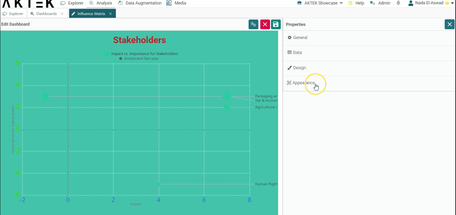
Appearance
- Sort legend by: Will sort the legend on top alphabetically or by value. You can then choose if you want the order (Order legend by) ascending or descending.
- Marks: This allows you to set a target for your data. For example, if the relevant issues should be less than 10, you can add it here, which will draw a dashed green line on the level of "10".
-
Compact mode: In case you have big numbers on any of the axes, you can enable the Compact mode that will display for example 1K instead of 1,000.
💡 Click on the link to learn more about Actions on Dashboards Elements.