
Use gradient colors to visually represent the scale of values within a dataset
Go to Analysis tab > Dashboards > Create/Edit a Dashboard > Add/Edit a GeoMap Chart component
💡 To add a map, drag and drop the GeoMap Chart option from the left-hand side of the screen onto the canvas.
- Locate the wrench icon in the top right corner of your component, or right-click the map with your mouse to open the action menu, and click Edit;
- In the section Available Layers, you will find 5 options to visualize and upload your data for the map;
- The last option displayed is Heatmap, which is useful to better visualize the volume of data/events at specific locations.
.gif?width=640&height=292&name=AKTEK%20iO%20(13).gif)
-
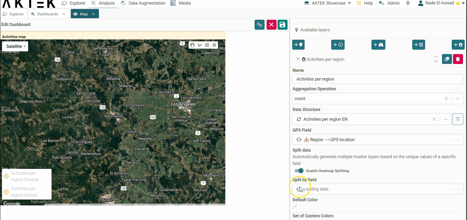
Click on Add New Heatmap Layer. Give it a name (e.g. Activities per region).
-
Then click underneath and select the Aggregation operation (i.e. Count) and the Data structure and choose the field you wish to retrieve the data from. Discover additional details regarding all the available aggregation operations here;
-
Choose the GPS field from the report you selected. The GPS field can be a reference as well.
-
Then select the Color. By default, the red color (with its shades) is used.
-
Click on Apply then on Save.
.gif?width=640&height=292&name=AKTEK%20iO%20(15).gif)
-
One more option you can use is to Split data.
-
Enable the Heatmap splitting toggle
- Select the field based on which you need to split
- Define the default color and other specific colors (if needed)
One more option you can use is to Split data.
-
- If you want this layer to load by default every time you open this dashboard, then enable the toggle Enable this layer on map loading. Otherwise, you can enable it manually from the legend of the map.
- Click on Apply then on Save.
💡 Operations offer different ways to aggregate numbers or units:
- Sum: the sum of all the values in the specified field for that dimension.
- Count: total number of entries in the specified field for that dimension.
- Min: smallest value in the specified field for that dimension.
- Max: largest value from the specified field for that dimension.
- Avg: the average of the values in a specified column for that dimension.
- Last: a value from the last row of a sorted group. This means the last value entered for that dimension.