
Track trends and patterns over time with a line chart to make data-driven decisions
Add a line chart to your Dashboards
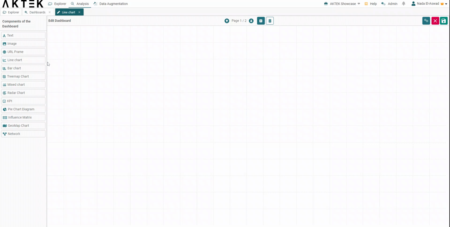
Go to Analysis tab > Dashboards > Create/Edit a Dashboard
In this section, we will build a Line Chart and use the Split Data and Target functions.
💡 A Line Chart is often used to visualize a trend in data over intervals of time – a time series – thus the line is often drawn chronologically.
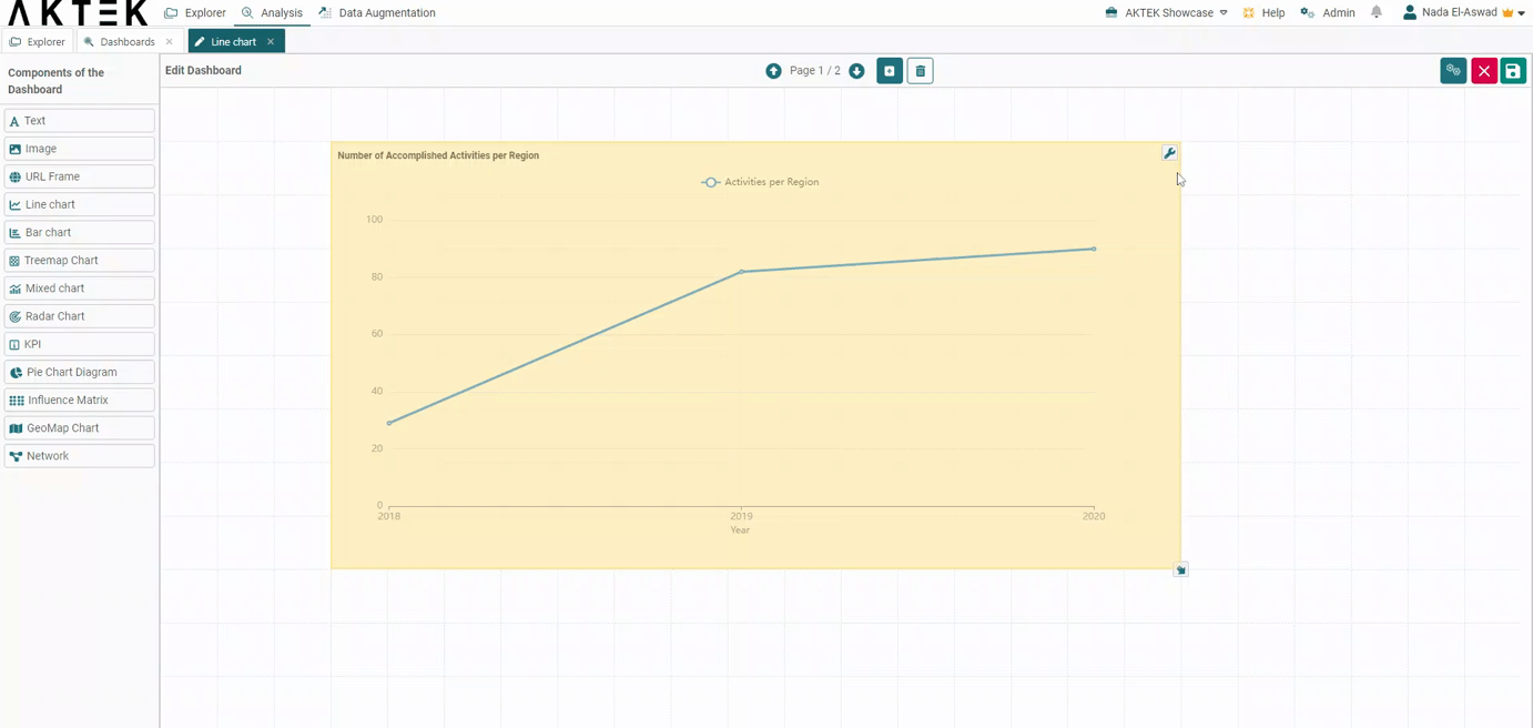
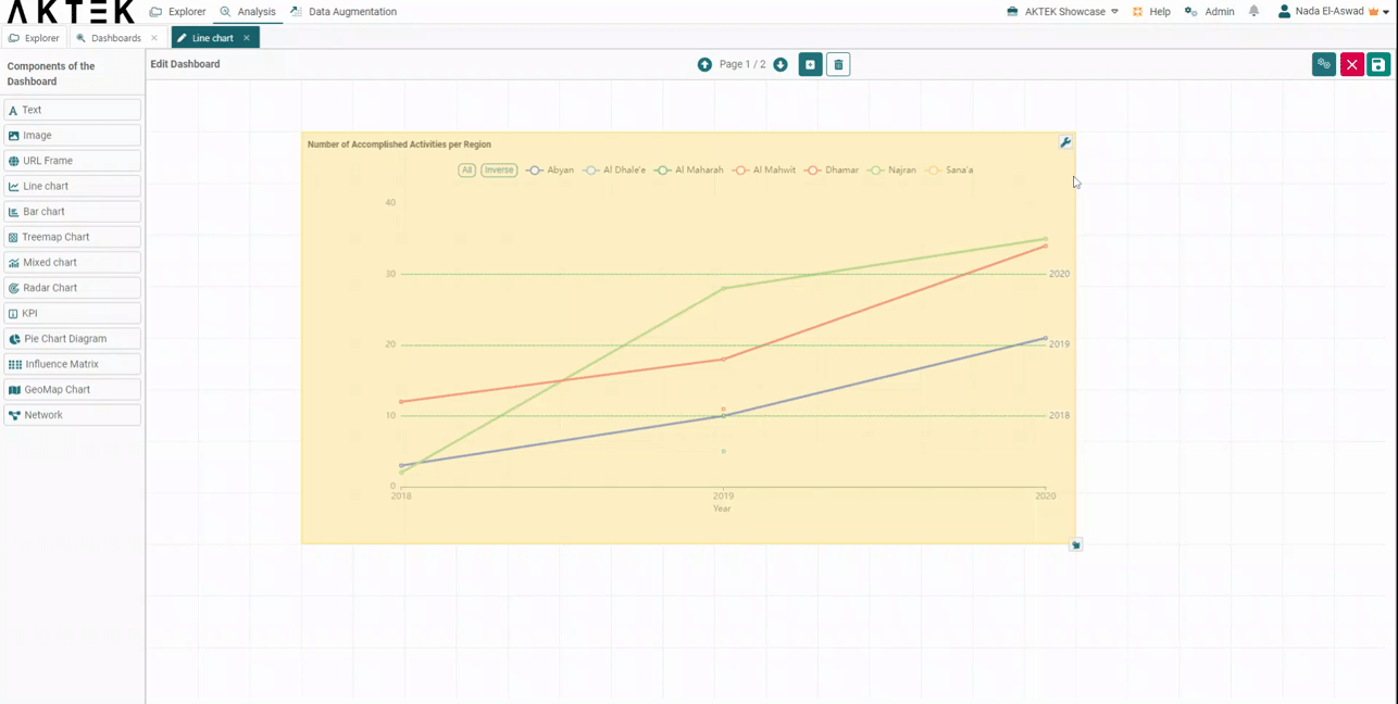
- Line Charts in AKTEK iO consist of a general title, a dimension, measure(s), split data function, and appearance. In this example, we will build a Line Chart to show the Number of Accomplished Activities per Region.
-
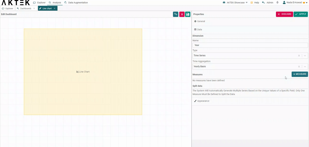
Select a Dimension. In order to divide the chart by year, you will need to select Time Series instead of Report Data. In this case, we select Time aggregation (year). Make sure the report you wish to retrieve data from has a date field included.
-
Now add a Measure. Add a Title, Operation, Report, Field, Time Field, Measure Color, and Line thickness (e.g. Activities per Region, Sum, # of activities, year, blue, and 5).
-
The report has more than one data entry input per year. Because of this, the Sum operation was selected.
Discover additional details regarding all the available aggregation operations here.
-
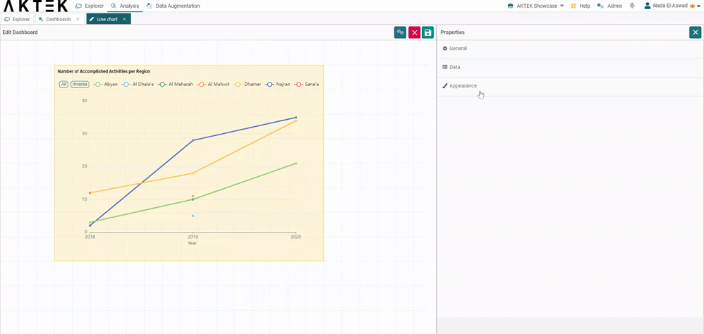
Now, in order to see our yearly data divided by regions, we select the Split Data function. You will have to enable measure splitting and select the field that will split your data. In this case, we select Region. You can also select a series color:
- Random: AKTEK iO will assign the colors to your bars automatically.
- From color field: if you have a color field in your report (it can be a reference field too).
- By value: you can assign a color to each value available in the field you selected.
-
Finally, you can add different Marks to your charts. Go to the section called Appearance and add a Name and Value to your marks. Every target will appear as a dotted light-green line on your chart. This will allow you to compare your objectives against results.
-
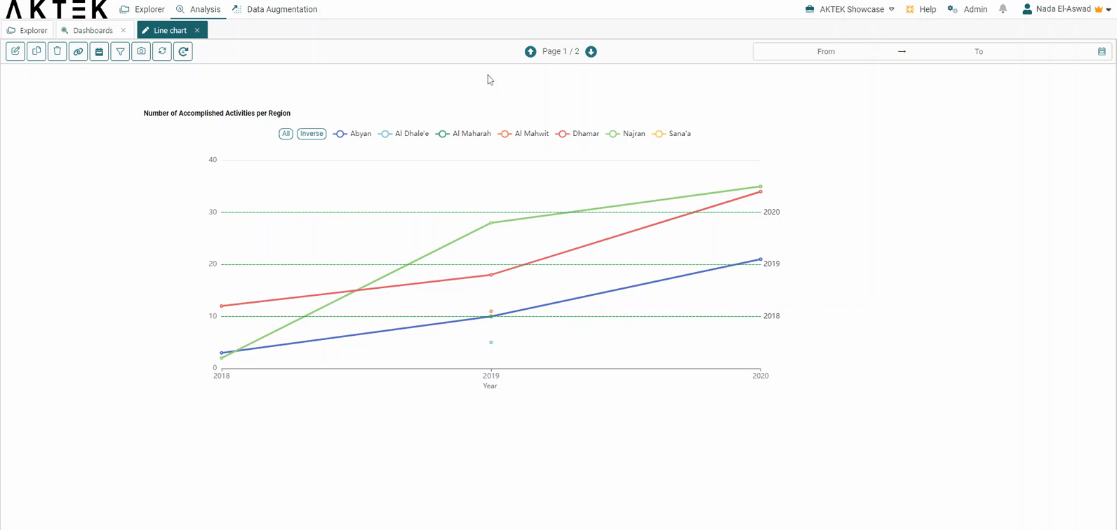
Now you created a Line Chart using split data + marks and can interact directly with it by clicking on the legend buttons.
-
Finally, you can filter a measure by clicking on the filter icon next to the data structure.
The smart filter view will open, and you can use a pre-saved filter or set new condition(s). For example, you can filter the activities by rating and display only the activities having a rating higher than 5/10.
Another use case is to duplicate the same measure and filter one of them to one activity name. This way, you can compare the data related to all activities in this region to one important activity that happened in the same region.
-
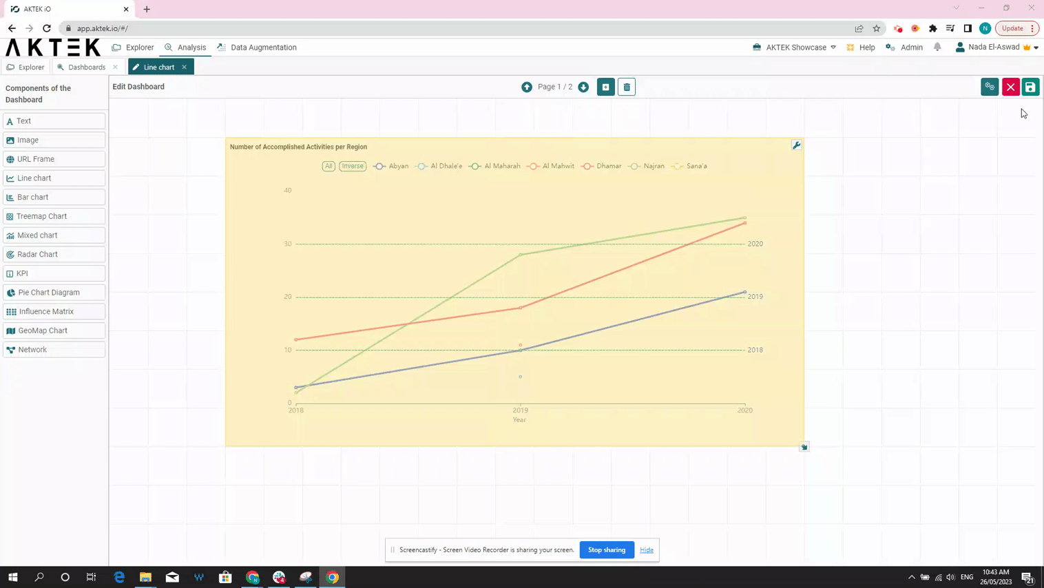
To edit, simply click Edit again on the top right and right-click over your Line chart.
-
Hover over the chart to reveal the Full-screen icon in the top right corner of the chart. It will open in full screen for a better display during the presentation. Click on the X button to return to normal view.
-
Click on any entry from the legend to show it or hide it from the Line Chart.
If you have 5 or more elements in the legend, two buttons will show next to the legend: All and Inverse:
-
You can click on All to show all the legend elements on the chart if not showing.
-
You can click on Inverse to inverse the selection, i.e. to show the elements that were hidden and hide the elements that were shown on the chart.
-
⚠️ The number of your mark’s value will affect the scale of your graph.
💡 Operations offer different ways to aggregate numbers or units:
- Sum: the sum of all the values in the specified field for that dimension.
- Count: total number of entries in the specified field for that dimension.
- Cumulative Sum: the total sum of all values cumulated over time (if the dimension is a Time series) or cumulated based on the selected dimension (if it's a field in the data structure).
- Min: smallest value in the specified field for that dimension.
- Max: largest value from the specified field for that dimension.
- Avg: the average of the values in a specified column for that dimension.
- Last: a value from the last row of a sorted group. This means the last value entered for that dimension.
- Unique count: distinct values count of a specified field for that dimension.
💡 After you Save the dashboard, you can right-click on the chart to download it. It will save this chart as an image on your machine.
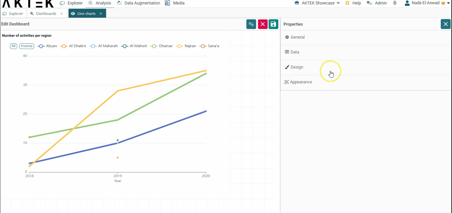
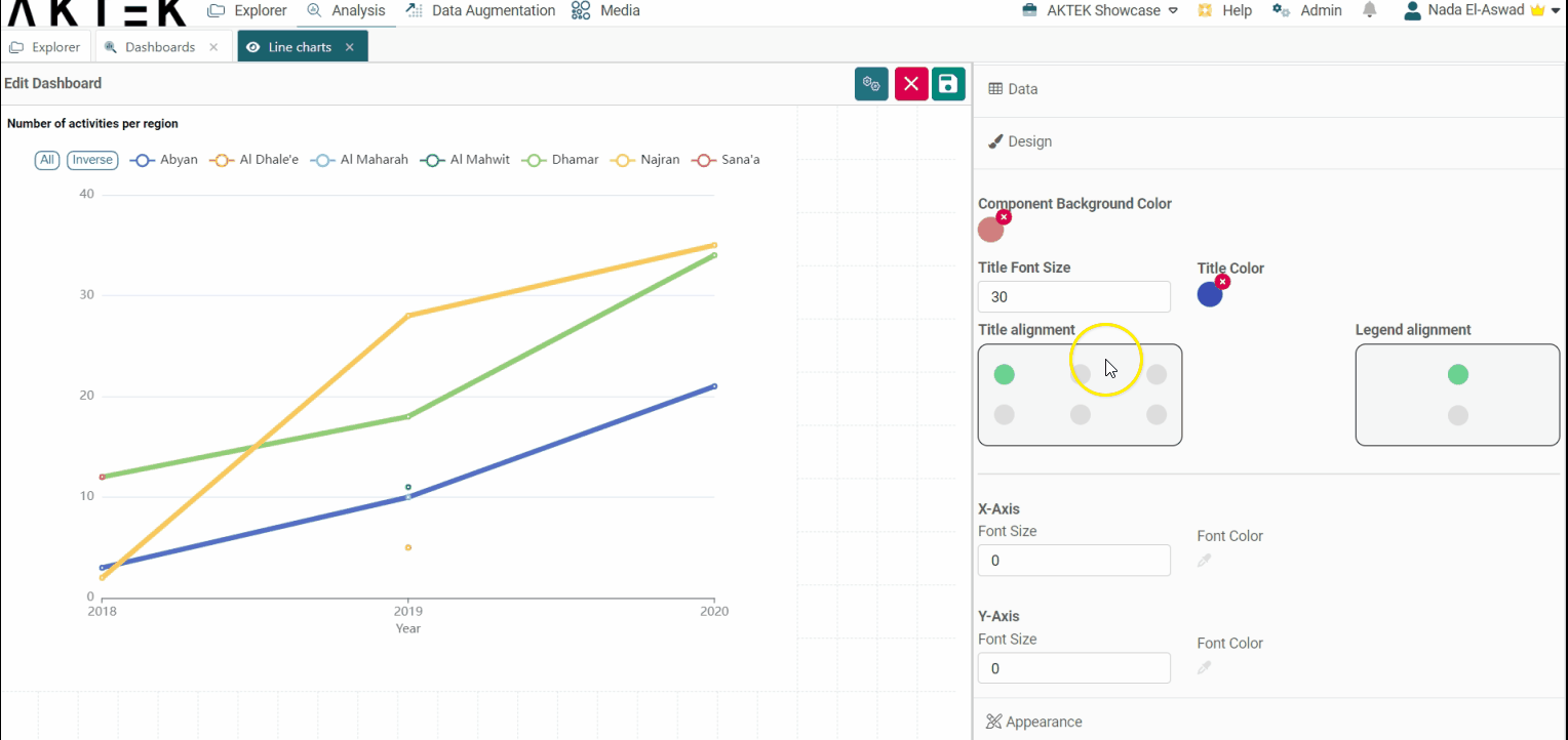
Design
- Component background color: Leave it unselected if you want a white background. You can also set the default color from the Company settings > Branding theme > Charts Background Color
- Title font size and Title color: Edit the default size (12) and the default color (black).
-
Title alignment: You can choose one of the six positions (top left, top center, top right, bottom left, bottom center, bottom right). Click on the bubble of the desired position.
-
Legend alignment: You can choose one of the two positions (top middle or bottom middle). Click on the bubble of the desired position.
-
X-axis and Y-axis: Customize the font size and color on the axes.
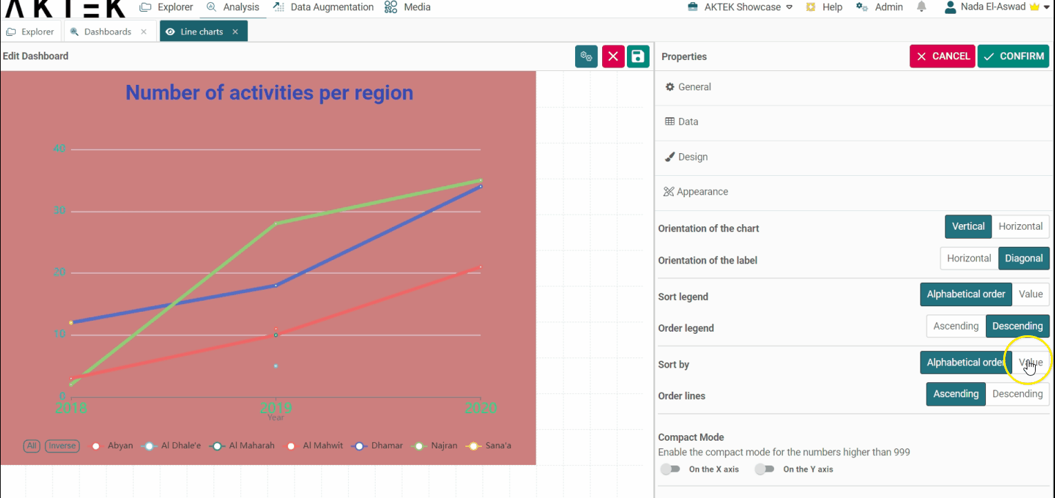
Appearance
- Orientation of the chart: The chart view can be vertical or horizontal.
- Orientation of Label: Choose if you want the dimensions' labels to show horizontally or diagonally. It's advised to use diagonal when you have many bars to fit more labels on the display view.
- Sort legend by: Will sort the legend on top alphabetically or by value. You can then choose if you want to Order legend by ascending or descending.
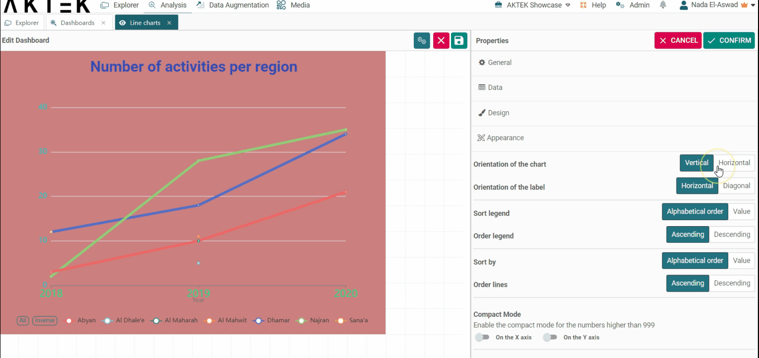
-
Sort Lines by: Will sort the dimension (x-axis) by value or alphabetically.
You will be asked to choose if you want the order to be Ascending or Descending, and which measure will define the order (in case of multiple measures).
-
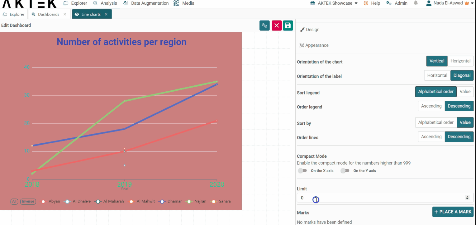
Compact mode: In case you have big numbers on any of the axes, you can enable the Compact mode that will display for example 1K instead of 1,000.
-
Limit: After ordering the chart, you can add a limit for the information you need to see. For example, if you order by value - ascending, then put a limit of 2: you will see the lowest 2 values only.
-
Marks: Place a mark to define a reference value. It will trace a dotted line at the corresponding value.
💡 Click on the link to learn more about Actions on Dashboards Elements.