
Build a Mixed Chart to compare specific categories and represent a measured value
Table of contents
Add a mixed chart to your Dashboards
Go to Analysis tab > Dashboards > Create/Edit a Dashboard
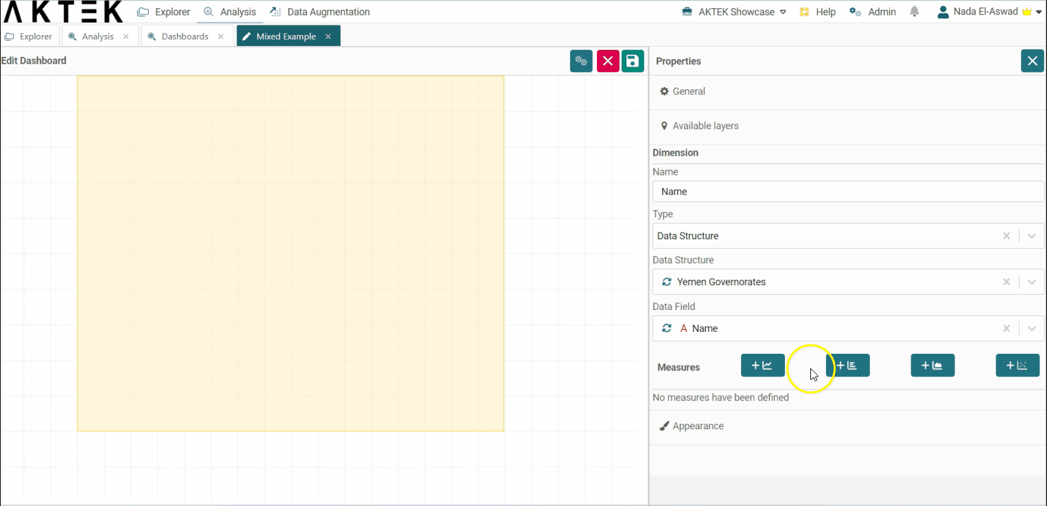
Mixed Charts in AKTEK iO consist of a general title, layer(s), and appearance. In this example, we will build a Mixed Chart to show the number of activities per region v/s the number of new shops that have opened in each region.

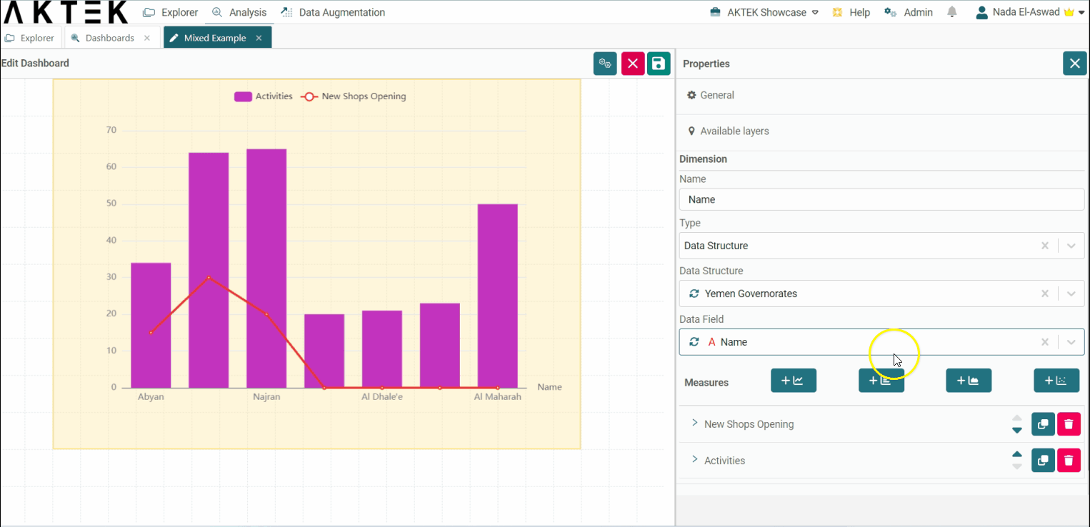
- Select a Dimension. In order to divide the chart by region, you will need to select Data structure (where the regions are saved), then under Data field, choose the field that contains the names.
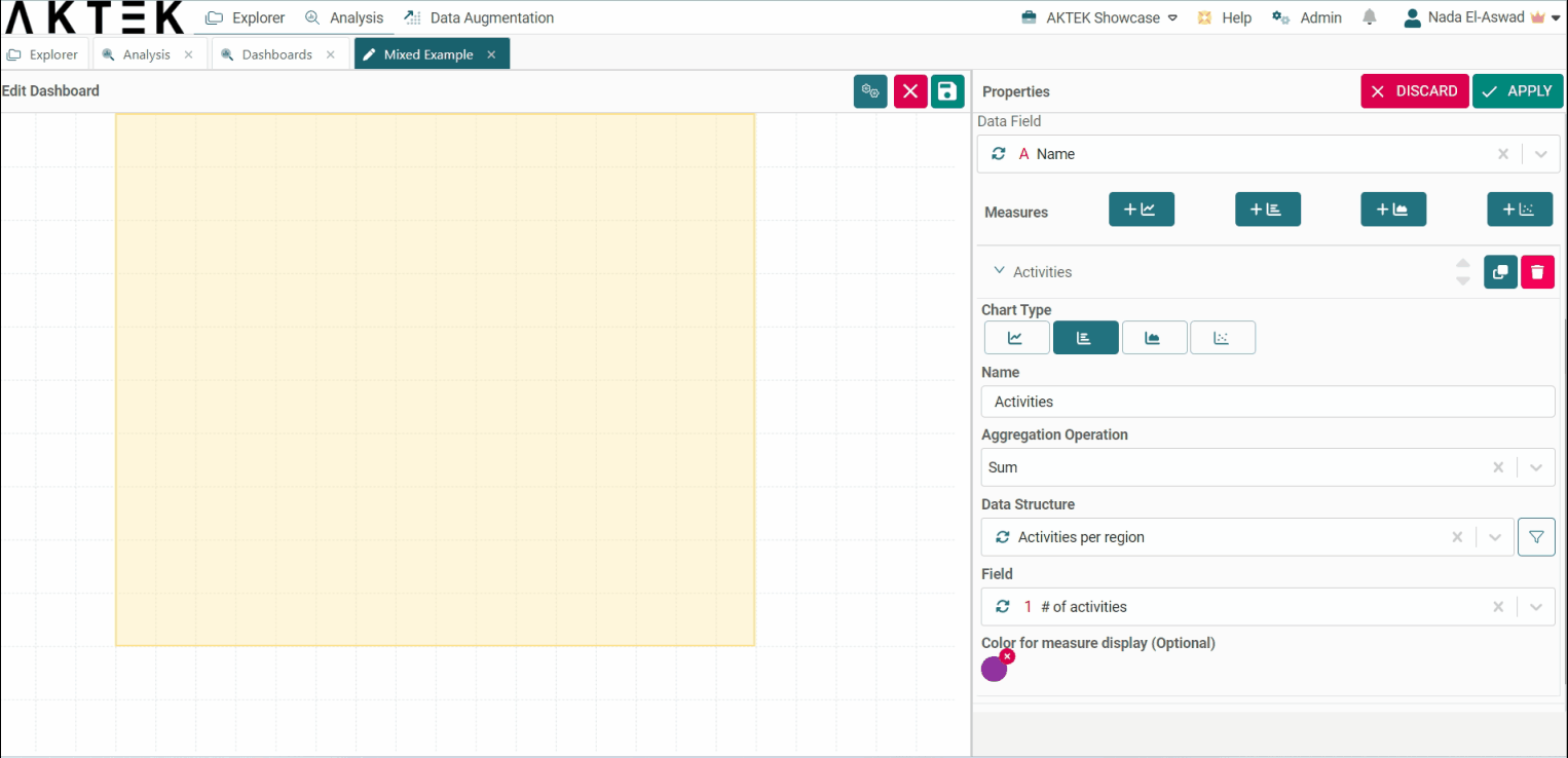
- Now start adding layers consisting of one type of chart: bar, line, area, or scatter. In the layer also, we will define the desired measure and we will configure it.
-
Choose a bar chart type, and configure it as below:
-
Name: Activities
-
Aggregation operation: sum
-
Data structure: Choose here the data structure that contains the information about activities done per region
-
Data field: choose the numeric field which contains the number of activities.
-
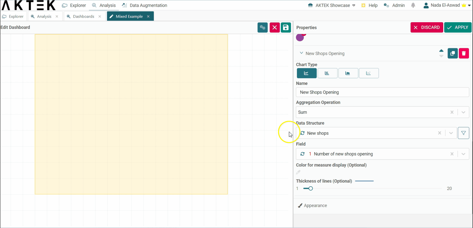
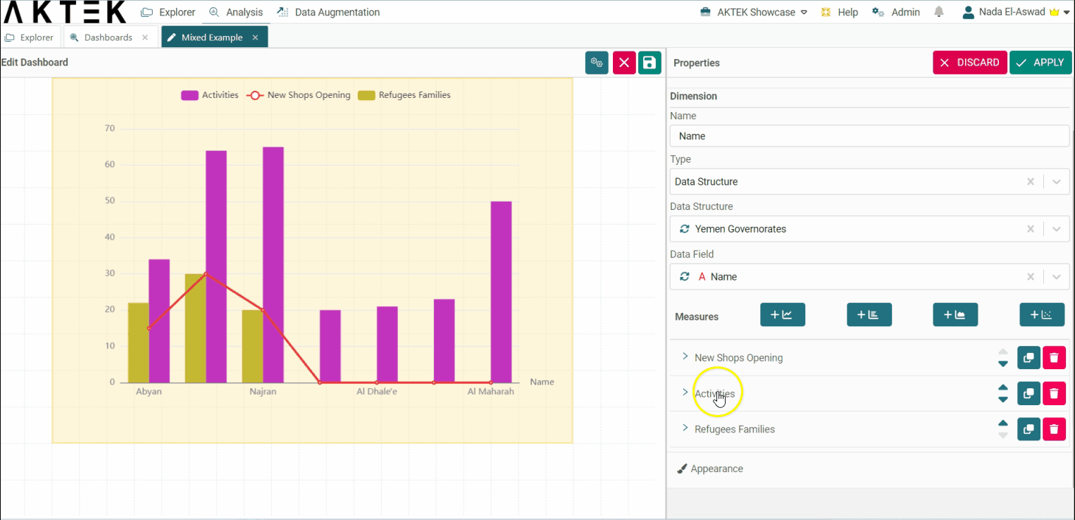
- Click on Line chart to add a new measure (layer) and configure it as below:
-
Name: New shops opening
-
Aggregation operation: sum
-
Data structure: Choose here the data structure which contains the information about new shops opening per region
-
Data field: choose the numeric field which contains the number of shops.
-
-
You can add more layers with Area and Scatter charts to see and compare more data related to these regions.
-
Other options you can use, depending on the layer type are:
-
Measure color
-
Line thickness
-
Stacking
-
Measure filtering
-
-
Now, let's try to add many bars on top of each other to visualize different types of data. To do so, we will use the Has stack toggle inside each bar measure.
-
First, add a new measure (layer) by clicking on the Bar chart type as shown previously.
-
Configure the layer to count the number of refugee families.
-
Open the layers that you want to group and enable the Has Stack toggle. This will add the bar charts on top of each other.
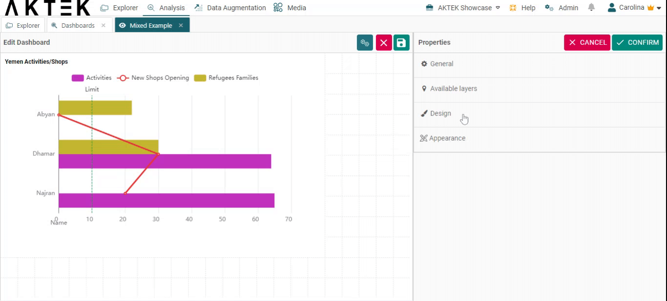
Finally, one more option for the measures is a Measure filter.
- Next to the Data structure dropdown, click on the filter icon.
- Set your rule(s) and click on Apply.
- For this example, let's filter the activities since 1st January 2020. We will apply the same filter to all layers in order to see the relationship between activities/refugees and new shops since 01/01/2020.
- After creating your rules, Apply the changes to your chart and Save your dashboard.
💡 Operations offer different ways to aggregate numbers or units:
- Sum: the sum of all the values in the specified field for that dimension.
- Count: total number of entries in the specified field for that dimension.
- Cumulative Sum: the total sum of all values accumulated over time (if the dimension is Time series) or cumulated based on the selected dimension (if it's a field in the data structure).
- Min: smallest value in the specified field for that dimension.
- Max: largest value from the specified field for that dimension.
- Avg: the average of the values in a specified column for that dimension.
- Last: a value from the last row of a sorted group. This means the last value entered for that dimension.
- Unique count: distinct values count of a specified field for that dimension.
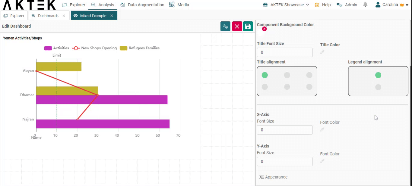
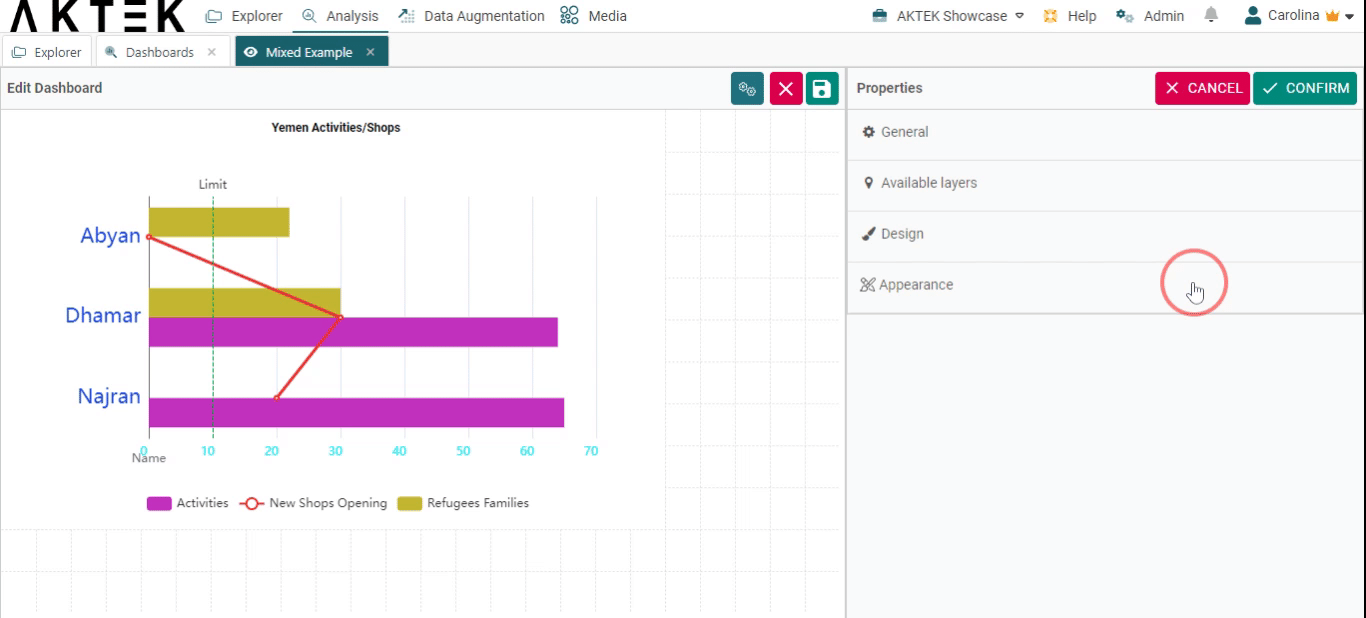
Design
- Component background color: Leave it unselected if you want a white background. You can also set the default color from the Company settings > Branding theme > Charts Background Color.
- Title font size and title color: Edit the default size (12) and the default color (black).
- Title alignment: You can choose one of the six positions (top left, top center, top right, bottom left, bottom center, bottom right). Click on the bubble of the desired position.
- Legend alignment: You can choose one of the two positions (top middle or bottom middle). Click on the bubble of the desired position.
- X-axis and Y-axis: Customize the font size and color on the axes.
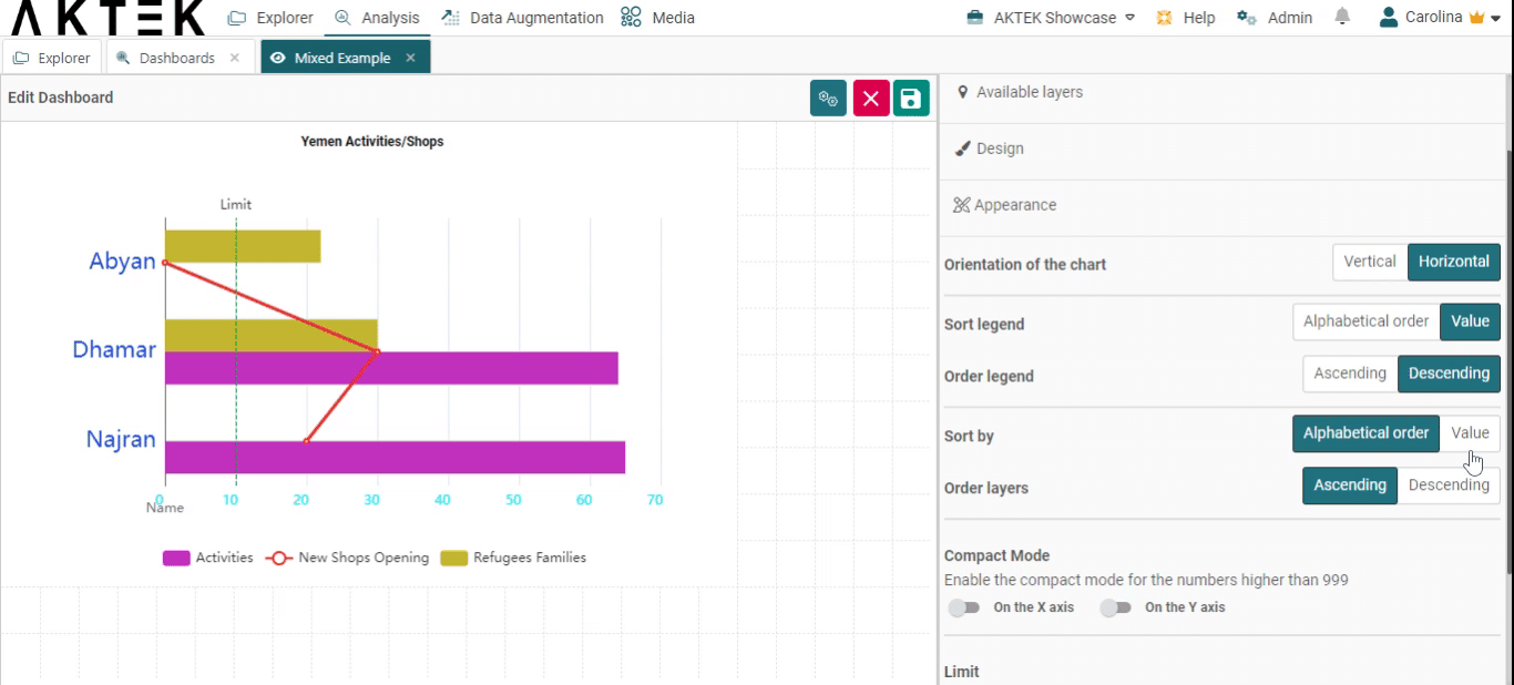
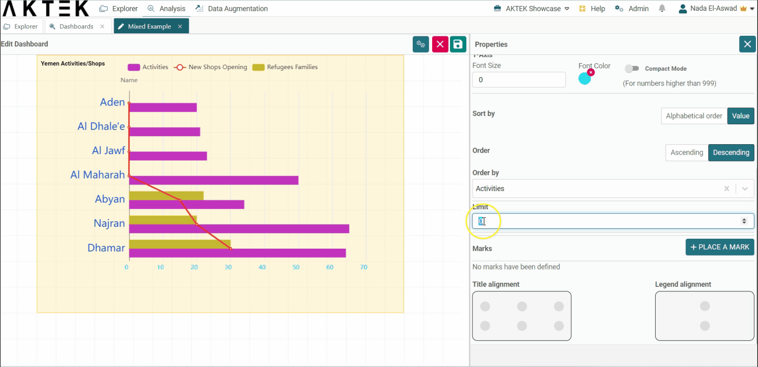
Appearance
- Orientation: choose if you want to see the bars horizontally or vertically. Vertical is the default one.
- Sort legend by: Will sort the legend on top alphabetically or by value. You can then choose if you want the order (Order legend by) ascending or descending.
- Sort layers: Will sort the dimension (x-axis) by value or alphabetically.
- Compact mode: In case you have big numbers on any of the axes, you can enable the Compact mode that will display for example 1K instead of 1,000.
-
Limit: After ordering the graph, you can add a limit for the number of information you need to see. In our example, if you order by value - ascending, then put a limit of 2: you will see the lowest 2 values (on 2 regions) only.
-
Marks: Allows you to set a target for your data. For example, if the number of activities per region is targeted to be a minimum of 10, you can add it here, which will draw a dashed green line on the level of "10". If the Orientation of your graph is vertical, the mark will be drawn horizontally, and vice versa.
💡 Click on the link to know more about Actions on Dashboards Elements.