
Radar charts are ideal for showing values relative to a center point and highlighting exceptions to a trend
Table of contents
Go to Analysis tab > Dashboards > Create/Edit a Dashboard
In this section, we will build a radar chart and learn to interact with it.
The Radar chart is a good tool for comparing numerical values for at least 3 sets of data. It is ideal for showing values relative to a center point, and is ideally suited for showing exceptions to a trend.
In other terms, it determines which variable in the data is doing better than the rest.
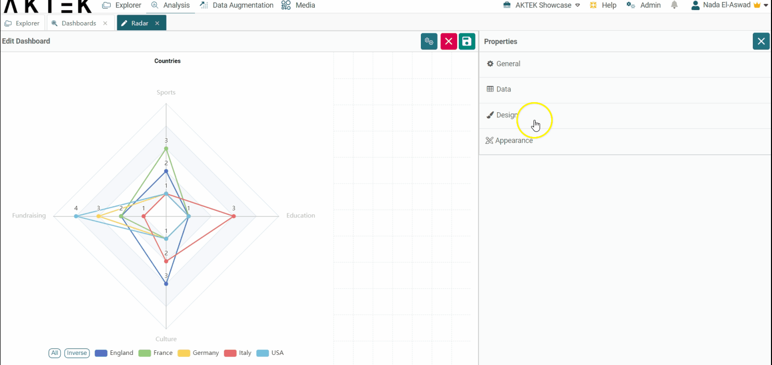
Creating a Radar Chart
- Drag and drop the radar chart to your dashboard.
- Edit the chart to configure the properties.
- Add a title (optional).
- Add a Dimension. It can be a field from a certain data structure or time series. Each unique value of the selected field (or time) will be represented by a different line on the chart with a different color.
- Add at least 3 measures. The measures are the data sets that you are trying to compare against the selected Dimension. Then Save.
Discover additional details regarding all the available aggregation operations here..gif?width=640&height=292&name=AKTEK%20iO%20(25).gif)
💡 Operations offer different ways to aggregate numbers or units:
- Sum: the sum of all the values in the specified field for that dimension.
- Count: total number of entries in the specified field for that dimension.
- Cumulative Sum: the total sum of all values cumulated over time (if the dimension is a Time series) or cumulated based on the selected dimension (if it's a field in the data structure).
- Min: smallest value in the specified field for that dimension.
- Max: largest value from the specified field for that dimension.
- Avg: the average of the values in a specified column for that dimension.
- Last: a value from the last row of a sorted group. This means the last value entered for that dimension.
- Unique count: distinct values count of a specified field for that dimension.
Application Example
Let's try an example where you need to compare the total number of cultural, educational, sportive, and fundraising activities done in each country.
As prerequisites, you need to have a report (data structure) where the counties are saved and a report for each type of activity where you have the data and where the country is referenced.
In the radar chart, select the following:
-
Dimension: select the Data structure having the countries
-
Measure 1: Count (Aggregation) from Cultural Activities field.
-
Measure 2: Count (Aggregation) from Educational Activities field.
-
Measure 3: Count (Aggregation) from Sportive Activities field.
- Measure 4: Count (Aggregation) from fundraising Activities field.
.gif?width=640&height=292&name=AKTEK%20iO%20(26).gif)
You can apply a filter to any of the measures, to analyze the data of interest.
✅ To analyze your chart, check where the line is diverging from the center, this will be the activity doing well (having a higher count). Usually, the center of the chart is the zero of each axis.
Interacting with your Radar Chart
After saving your radar chart, you can interact with it:
- Click on a line or node to read the values of each measure
- Click on the legend to turn on/off certain values of the dimension.
- Right-click on the chart to download it as an image.
-1.gif?width=640&height=292&name=AKTEK%20iO%20(27)-1.gif)
- Expand the chart to full screen by clicking on the expand icon in the top right corner of the chart.
- If you have 5 or more elements in the legend, two buttons will show next to the legend: All and Inverse:
-
You can click on All to show all the legend elements on the chart if not showing.
-
You can click on Inverse to inverse the selection, i.e. to show the elements that were hidden and hide the elements that were shown on the chart.
-1.gif?width=640&height=266&name=AKTEK%20iO%20(28)-1.gif)
-
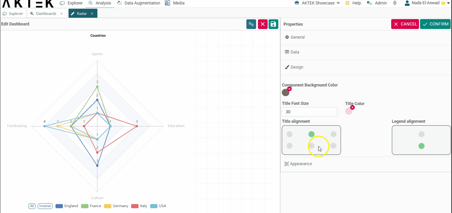
Design
- Component background color: Leave it unselected if you want a white background. You can also set the default color from the Company settings > Branding theme > Charts Background Color.
- Title font size and Title color: Edit the default size (12) and the default color (black).
-
Title alignment: You can choose one of the six positions (top left, top center, top right, bottom left, bottom center, bottom right). Click on the bubble of the desired position.
-
Legend alignment: You can choose one of the two positions (top middle or bottom middle). Click on the bubble of the desired position.
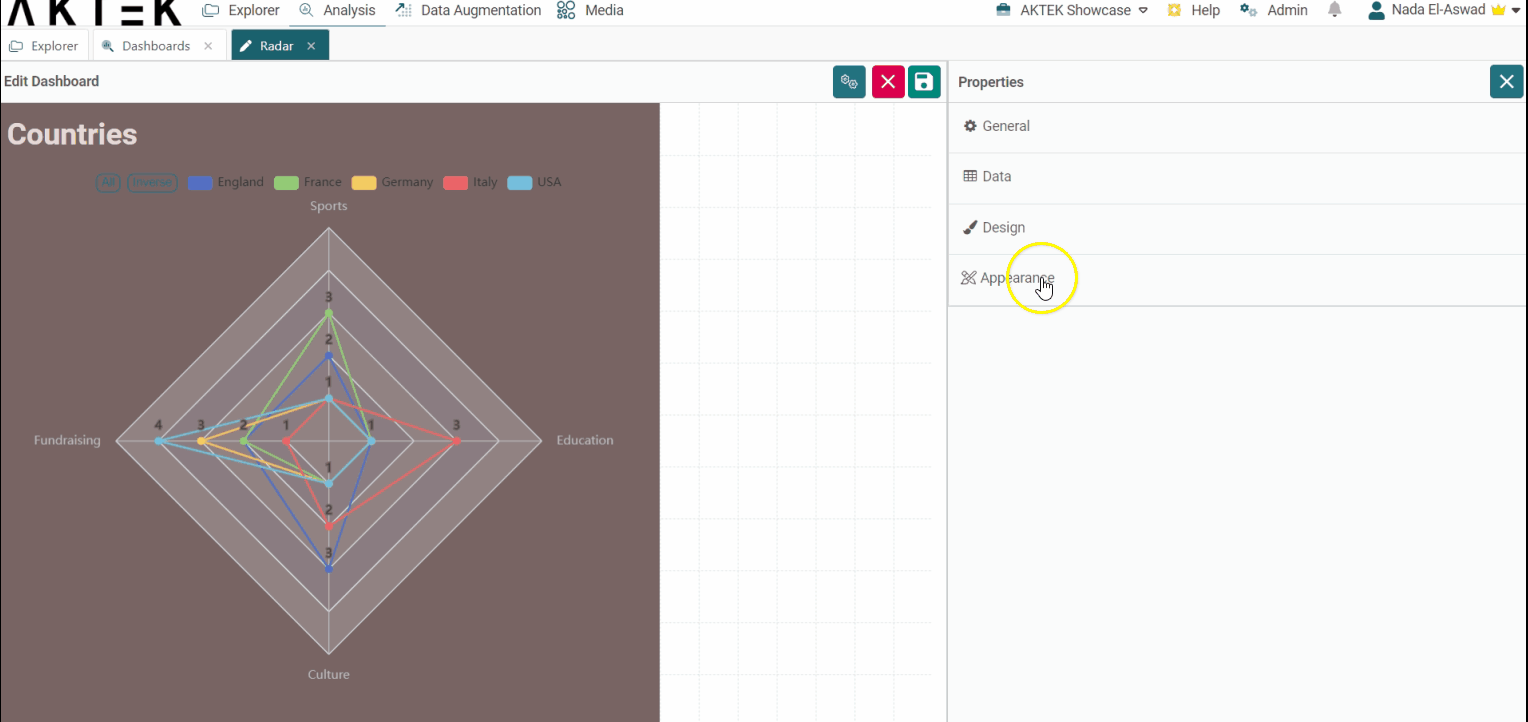
Appearance
- Sort legend by: Will sort the legend on top alphabetically or by value. You can then choose if you want the order (Order legend by) ascending or descending.
💡 Click on the link to know more about Actions on Dashboards Elements.