
A bar chart is a powerful tool for visualizing and comparing data on a dashboard
Table of contents
Create a Bar Chart
Go to Analysis tab > Dashboards > Create/Edit a Dashboard
Bar Charts in AKTEK iO consist of a general title, a dimension, measure(s), split data function, and appearance.
💡 Remember that in a Bar Chart, one axis of the chart shows the specific categories being compared, and the other axis represents a measured value.
-
To add the bar chart component, you should create a new dashboard or edit an existing one. You can select the dashboard you wish to add the bar chart to from the selector menu;
-
Drag and drop the Bar Chart component option from the left-hand side of the screen onto the canvas;
In this example, we will build a Bar Chart to show the Number of Activities per Region in the Last Three Years.-1.gif?width=640&height=292&name=AKTEK%20iO%20(29)-1.gif)
-
Select a Dimension. In Order to divide the chart by year, you will need to select Time Series instead of Data Report.
In this case, we select Time aggregation (year). Make sure the report you wish to retrieve data from has a date field included; -
Now, add a Measure. Add a Title, Operation, Report, Field, Time Field, and Measure Color (Optional), e.g. Attack per Region, Sum, # of activities, year & Blue;
- The report has more than one data entry input per year. Because of this, the Sum operation was selected, however, discover additional details regarding all the available aggregation operations here.
.gif?width=640&height=292&name=AKTEK%20iO%20(30).gif)
-
Now, in order to see our yearly data divided by regions, we select the Split Data function. You will have to enable measure splitting and select the field that will split your data. In this case, we select Region. You can also select a series color:
- Random: AKTEK iO will assign the colors to your bars automatically.
- From color field: if you have a color field in your report (it can be a reference field too).
- By value: you can assign a color to each value available in the field you selected.
.gif?width=640&height=292&name=AKTEK%20iO%20(31).gif)
-
You can filter a measure by clicking on the Filter icon next to the data structure.
The smart filter view will open, and you can use a pre-saved filter or set new conditions. For example, you can filter the activities having a success score higher than 5.
Another use case is to duplicate the same measure and filter one of them to one score value. This way, you can compare the data related to all scores in this region to one important score (i.e. 10) given in the same region;
-1.gif?width=640&height=292&name=AKTEK%20iO%20(32)-1.gif)
-
Now that you have your bar chart, Save the dashboard and right-click on the chart to download it. It will save this chart as an image on your machine;
-
Hover over the chart to reveal the Full-screen icon in the top right corner of the chart. It will open in full screen for a better display during the presentation. Click on the x button to return to normal view.
-2.gif?width=640&height=292&name=AKTEK%20iO%20(33)-2.gif)
-
Click on any entry from the legend to show it or hide it from the Bar Chart.
If you have 5 or more elements in the legend, two buttons will show next to the legend: All and Inverse:
-
You can click on All to show all the legend elements on the chart, if not showing;
-
You can click on Inverse to inverse the selection, i.e. to show the elements that were hidden and hide the elements that were shown on the chart.
-1.gif?width=640&height=292&name=AKTEK%20iO%20(34)-1.gif)
-
-
Now let's try to have many measures and to stack the bars. For this, edit again your dashboard and open the properties of your bar chart;
-
Disable splitting;
-
Add a second measure to count the number of operations;
-
Enable Has stack on both measures;
-
Save.
-1.gif?width=640&height=292&name=AKTEK%20iO%20(35)-1.gif)
⚠️ Reminder that splitting works when you only have one measure.
💡 Operations offer different ways to aggregate numbers or units:
- Sum: the sum of all the values in the specified field for that dimension.
- Count: total number of entries in the specified field for that dimension.
- Cumulative Sum: the total sum of all values cumulated over time (if the dimension is Time series) or cumulated based on the selected dimension (if it's a field in the data structure).
- Min: smallest value in the specified field for that dimension.
- Max: largest value from the specified field for that dimension.
- Avg: the average of the values in a specified column for that dimension.
- Last: a value from the last row of a sorted group. This means the last value entered for that dimension.
- Unique count: distinct values count of a specified field for that dimension.
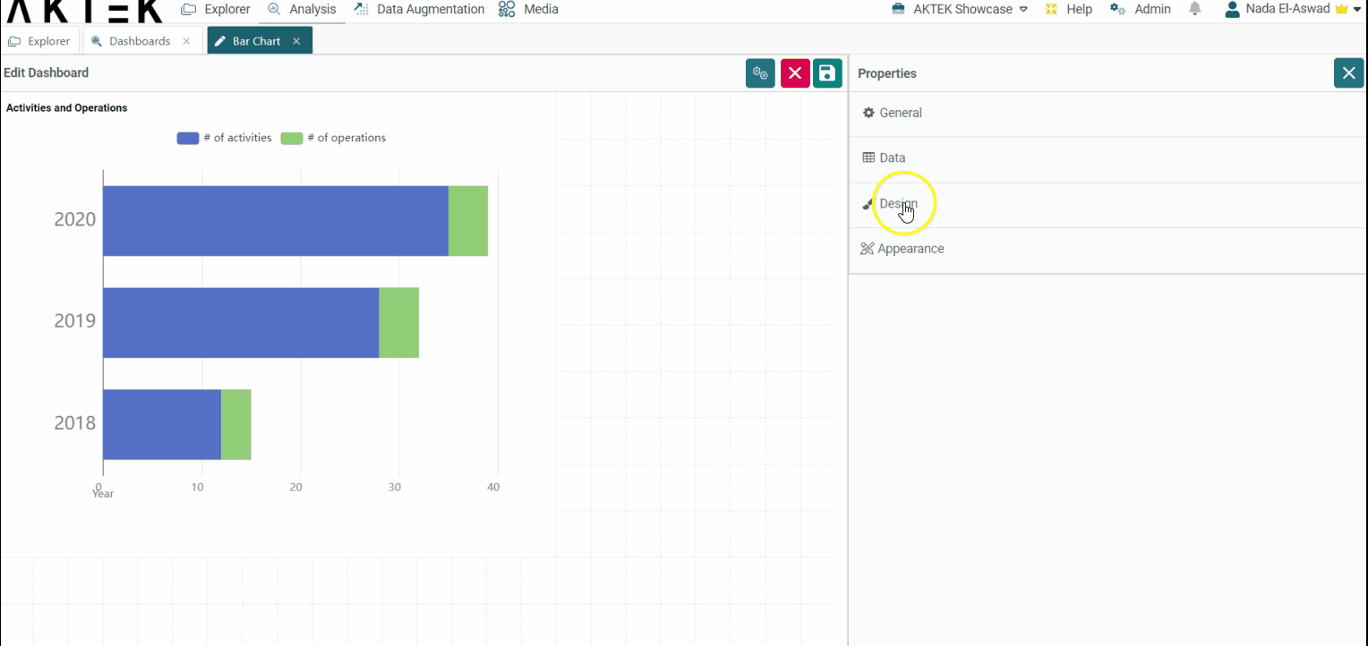
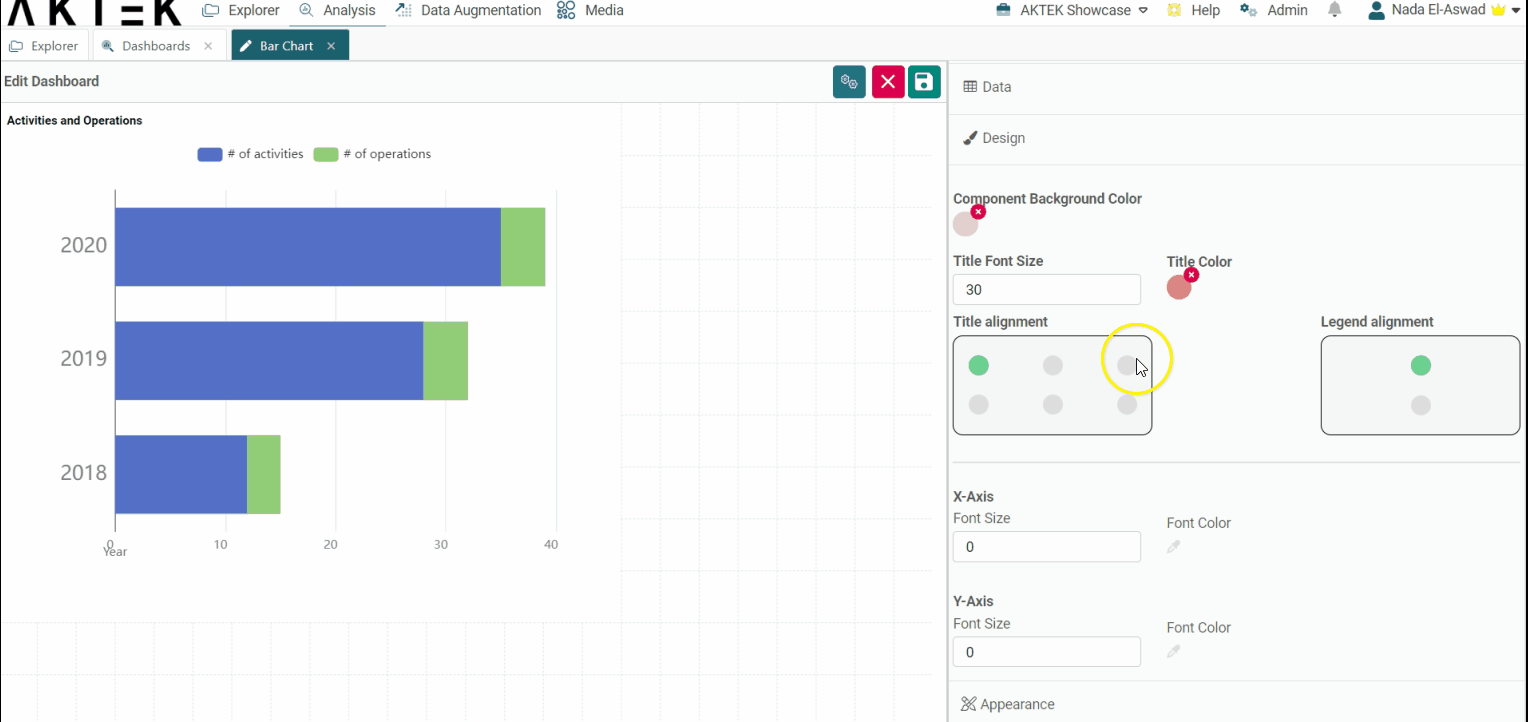
Design
-
Component background color: Leave it unselected if you want a white background. You can also set the default color from the Admin > Company settings > Branding theme > Charts Background Color.
-
Title font size and Title color: Edit the default size (12) and the default color (black).
- Title alignment: You can choose one of the six positions (top left, top center, top right, bottom left, bottom center, bottom right). Click on the bubble of the desired position.
- Legend alignment: You can choose one of the two positions (top middle or bottom middle). Click on the bubble of the desired position.
- X-axis and Y-axis: Customize the font size and color on the axes.
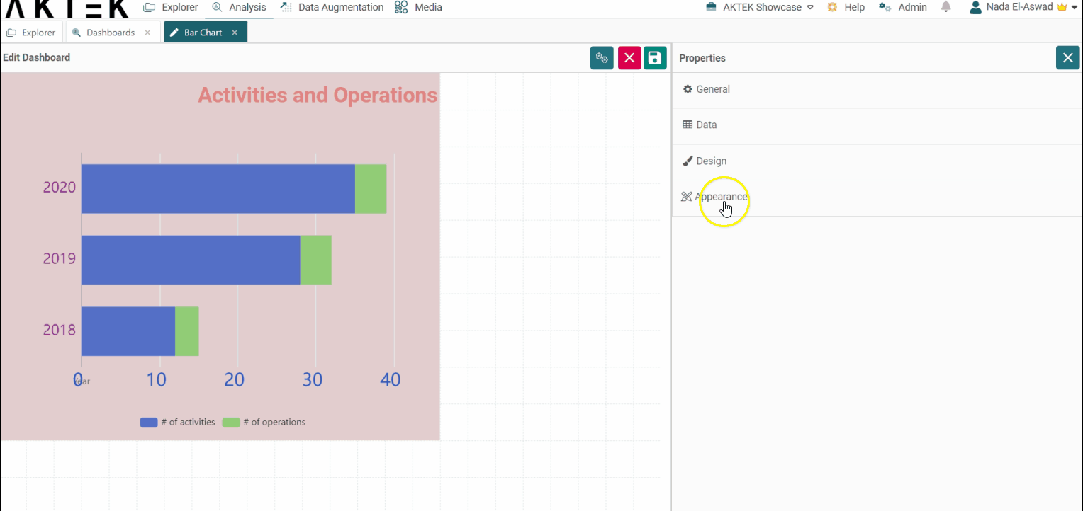
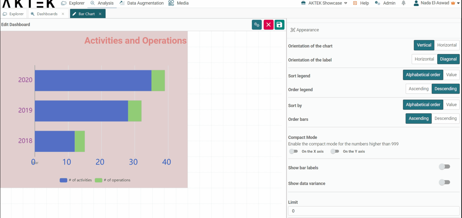
Appearance
-
Orientation of the chart: The chart view can be vertical or horizontal.
-
Orientation of Label: Choose if you want the dimensions' labels to show horizontally or diagonally. It's advised to use diagonal when you have many bars to fit more labels on the display view.
-
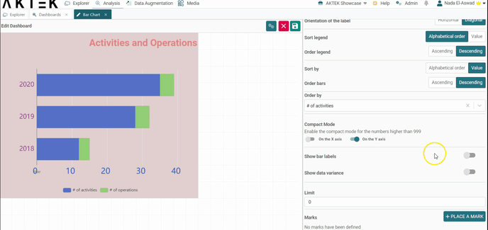
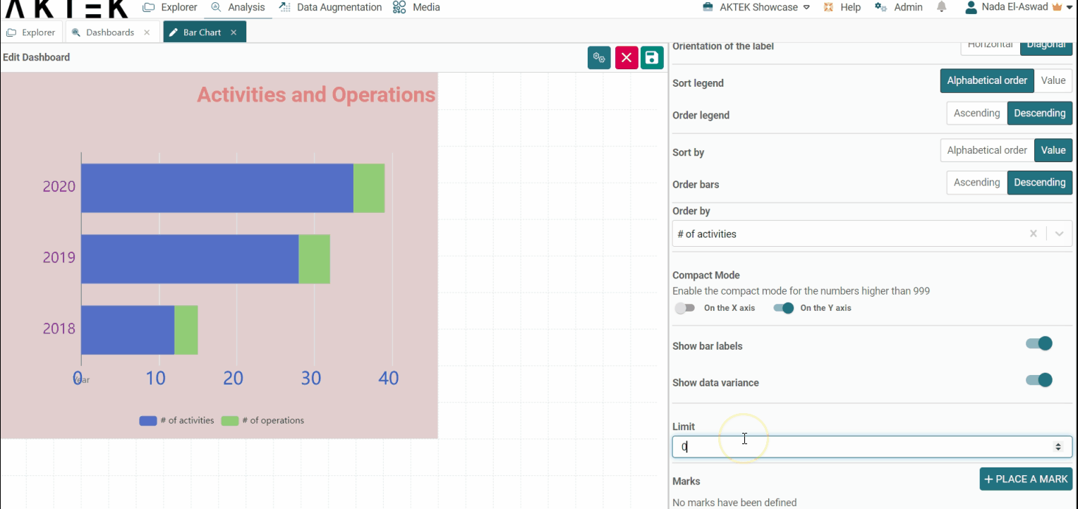
Sort legend: Will sort the legend on top alphabetically or by value. You can then choose if you want the order (Order legend) ascending or descending.
-
Sort by: Will sort the dimension (x-axis) by value or alphabetically.
You will be asked to choose if you want the order to be Ascending or Descending, and which measure will define the order (in case of multiple measures).
-
Compact mode: In case you have big numbers on any of the axes, you can enable the Compact mode that will display for example 1K instead of 1,000.
-
Show Bar Labels: When enabled, it will show the label inside the corresponding bar. The labels represent the dimension values of each bar. It's recommended to enable this toggle if you are saving the chart as an image or sharing it as a PDF.
-
Show Data Variance: When enabled, a line will connect the top of two adjacent bars and will display the percentage of the variation between the values of these bars.
-
Limit: After ordering the graph, you can add a limit for the information you need to see. For example, if you order by value - ascending, then put a limit of 2: you will see the lowest 2 values only.
-
Marks: This allows you to set a target for your data. For example, if the number of activities per date is targeted to be a minimum of 10, you can add it here, which will draw a dashed green line on the level of "10". If the Orientation of your graph is vertical, the mark will be drawn horizontally, and vice versa.
✅ Note that Show Data Variance and Show Bar Labels don't work when you have Data splitting on or, for the second option, multiple measures.
💡 Click on the link to know more about Actions on Dashboards Elements.