
Create graphs with iQ Social monitors data for an intuitive data visualization and analysis experience
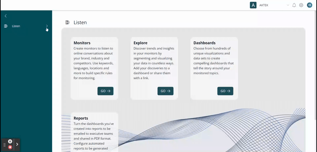
Go to iQ Social > Login using your credentials > Listen > Dashboards
- After opening the Dashboards section, you will see:
- The names of the dashboards that have been created in your organization;
- How many widgets the dashboard has;
- How many monitors are included in the dashboard;
- Whether the dashboard is private or public.
- In order to create a new dashboard, click on the + Create Dashboard located in the upper right corner. You must define the name and access permissions of the board you wish to create, which can be:
- Private: only you can see it and edit it;
- Public (view only): company users will be able to see it, but not edit it;
- Public: all company users can see it and edit it.
- You can choose to create your dashboards from a Template or a Custom Dashboard. You can among the following templates:
- Industry Dashboard: with preselected modules focused on identifying trends, influencers and opportunities for your industry or any general topic;
- Brand Analysis: with preselected modules focused on monitoring your brand;
- Classic Analysis: with preselected and most commonly used modules;
- Crisis Management: with preselected modules focused on monitoring a crisis;
- Event Management: with preselected modules focused on monitoring an event.
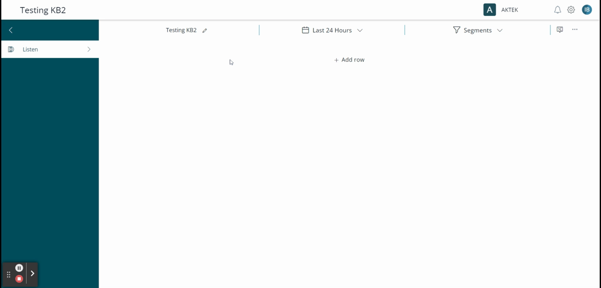
- After creating a new dashboard, a new window will open with the following control panel:
- Name of your monitor;
- Date range of the Dashboard: the default range is the last 24 hours;
- Segments: such as only Twitter mentions only;
- Search box;
- Command Center Mode: it will allow projecting in presentation mode the dashboard you have created;
- Three dots where you can Generate Report or use your current dashboard to Create Dashboard Template.
-
To add information, click on Add Row, then you'll see the option to define how many widgets you want to have in the same row.
The maximum of widgets you can have is three and the minimum is one. You can create as many rows as you want in your customizable dashboard. -
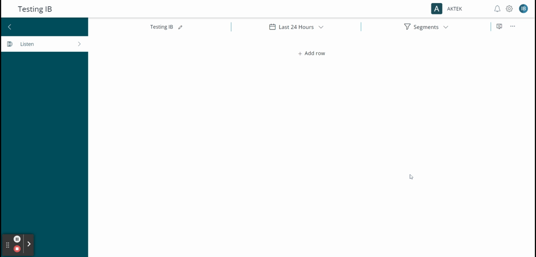
You will see that in this section there is a new function called Widget, which is created for displaying the information that you want to visualize on your dashboard.
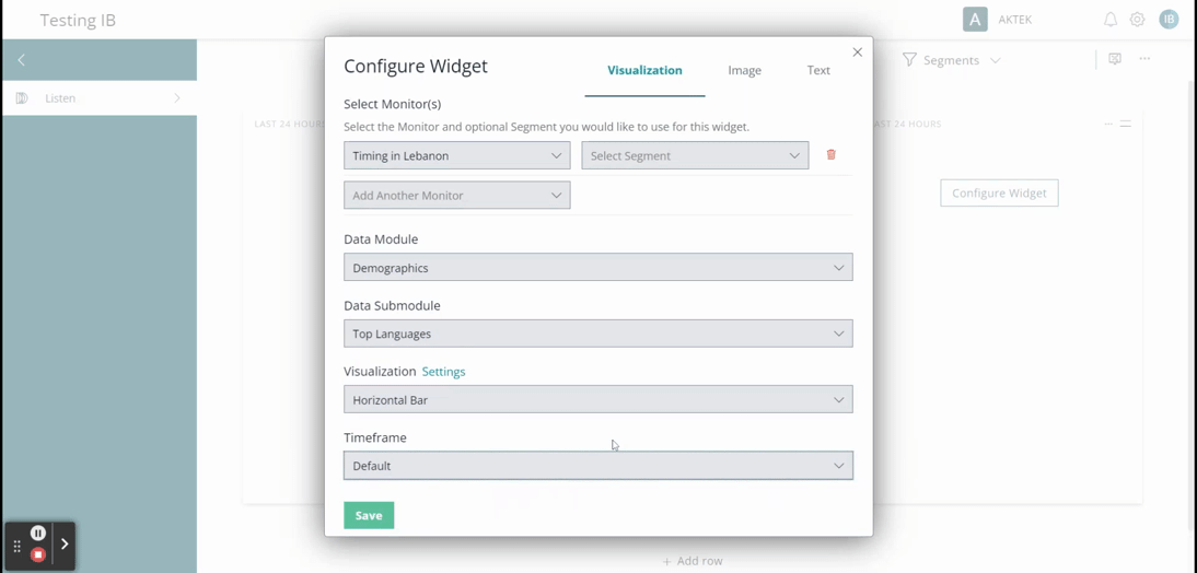
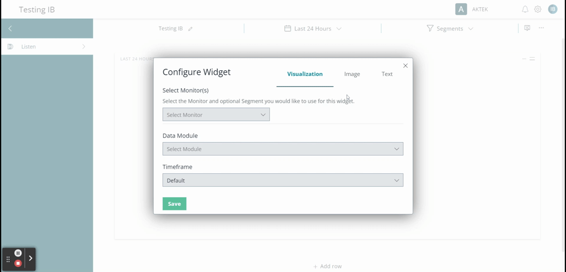
When you click on Configure Widget, a new window will open to configure the graphic you wish to visualize on your dashboard. -
You must Select Monitor, which can be one or more if you wish to compare them, optionally, you can select a Segment as well.
-
Then you must select a Data Module, which can be:
- Demographics;
- Engagements;
- Influencers;
- Language Analysis;
- Mentions;
- Reach and spread;
- Regions;
- Trends.
- Depending on the Data Module you chose, you'll have the option to select a Data Submodule and the type of Visualization you want to have on the dashboard. Check the options available here.
- Lastly, you will see the Timeframe option. Here you can define the period of time in which you want this information to be seen, it can be manually set or left as default. The options are:
- Last Hour;
- Last 3 hours, 6 hours, 12 hours, 24 hours;
- Today;
- Yesterday;
- Last 7 days, 14 days, 30 days;
- This month;
- Last month;
- Last 3 months, 6 months, 12 months;
- Fixed date range.
-
Still on the Configure Widget window, you can upload an Image or Text to your Dashboard by using the options in the top right corner;
- Once you are satisfied with the configuration of your widget, click on Save;
-
You can always edit your widget again, see it in full screen, delete it, add a new widget, or add a new row;
-
Also, you can drag and drop your widget next to another one, if you wish to have them in the same row.
💡 Here are some of the options you'll find on Data Submodules, which will be according to the Data Module chosen previously:
-
When you click on the module Demographics, you will see 10 submodules:
- Gender;
- Top Languages;
- Top Locations;
- Top Metropolitan Areas;
- Trending Author Bio Actions;
- Trending Author Bio Adjectives;
- Trending Author Bio Adverbs;
- Trending Author Bio Categories;
- Trending Author Bio Entities;
- Trending Author Bio Phrases.
-
When you click on the module Influencers, you will see the next submodules:
- Influencer score;
- Most active;
- Most mentioned;
- Most reach;
- Most reshares;
- Most spread;
- Sharing negative sentiment;
- Sharing positive sentiment.
-
When you click on the module Language Analysis, you will see the next submodules:
- Emotions;
- Intent;
- Sentiment;
- Subjectivity;
- Trending actions;
- Trending adjectives;
- Trending adverbs;
- Trending categories;
- Trending entities;
- Trending negative phrases;
- Trending phases;
- Trending positive phrases;
- Verb tense;
- Vulgarity.
-
When you click on the module Reach & Spread, you will see the next submodules:
- Legacy reach & spread;
- Mentions with most replies;
- Most liked mentions;
- Most shared mentions;
- Reach and spread.
-
When you click on the seventh Regions, you will see submodules for different countries like:
- Argentina regions;
- Australia regions;
- Brazil regions;
- Chile regions;
- Colombia regions;
- Costa Rica regions;
- Canada regions;
- France regions;
- Germany regions;
- Great Britain regions;
- Guatemala regions;
- India regions;
- Ireland regions;
- Japan regions;
- Mexico regions;
- Nicaragua regions;
- Nigeria regions;
- Peru regions;
- United States regions.
-
When you click on the eighth Trends you will see the next submodules:
- Rule set keyword matches;
- Trending domains;
- Trending emojis;
- Trending hashtags;
- Trending networks;
- Trending tags;
- Trending URLs.
💡 Depending on the Data Submodule chosen, you'll find some of these Visualization options:
-
-
Pie;
-
Bar;
-
List;
-
TreeMap;
-
Word Cloud;
-
Web;
-
Bubble Stream;
-
Line Graph;
-
Stream Graph;
-
Control Chart;
-
Reach and Spread;
-
Mentions;
-
World Map.
-