
A pie chart visually represents data by dividing it into segments to show the proportion of each category
Table of contents
Create a Pie Chart
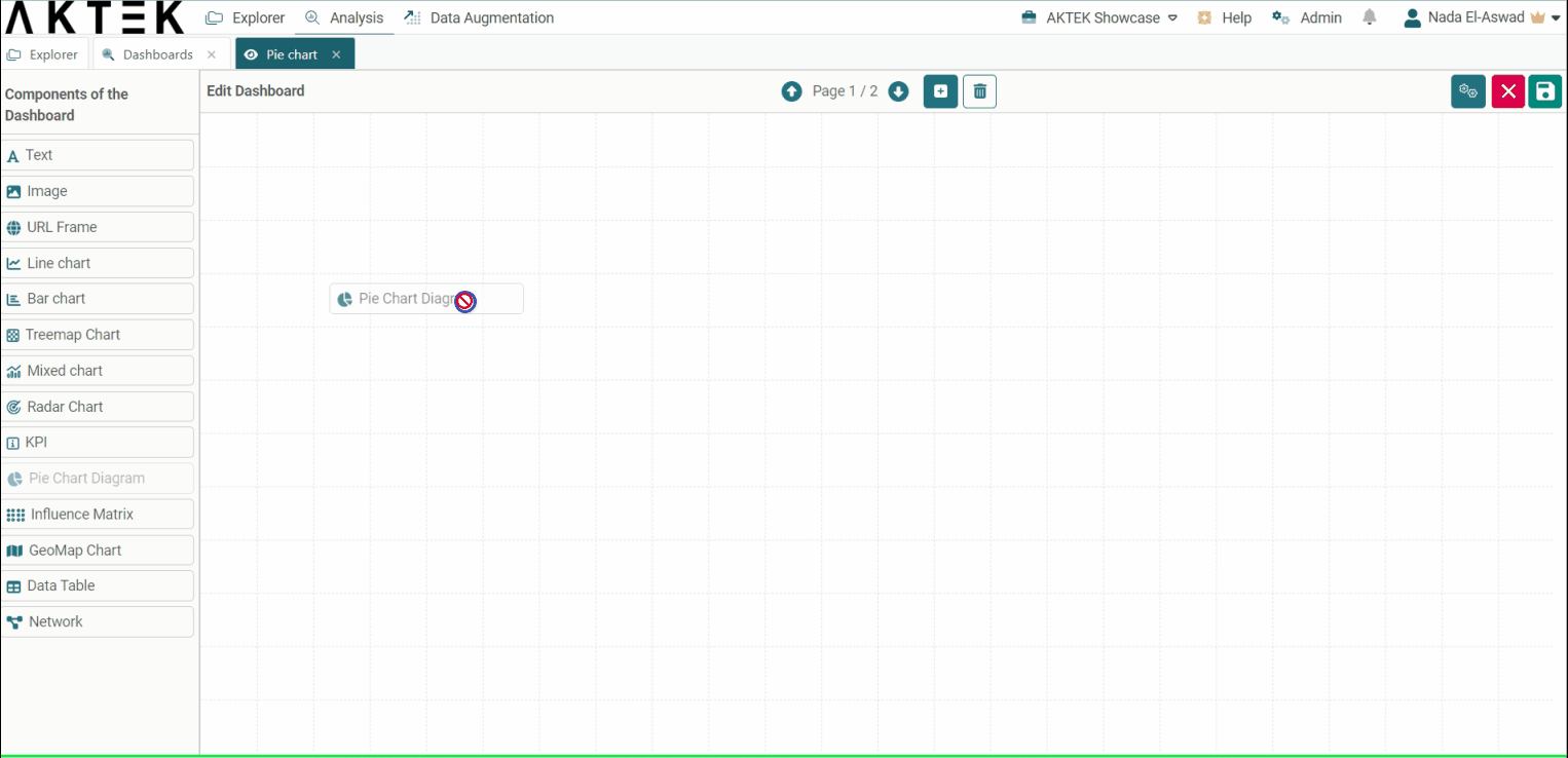
Go to Analysis tab > Dashboards > Create/Edit a Dashboard
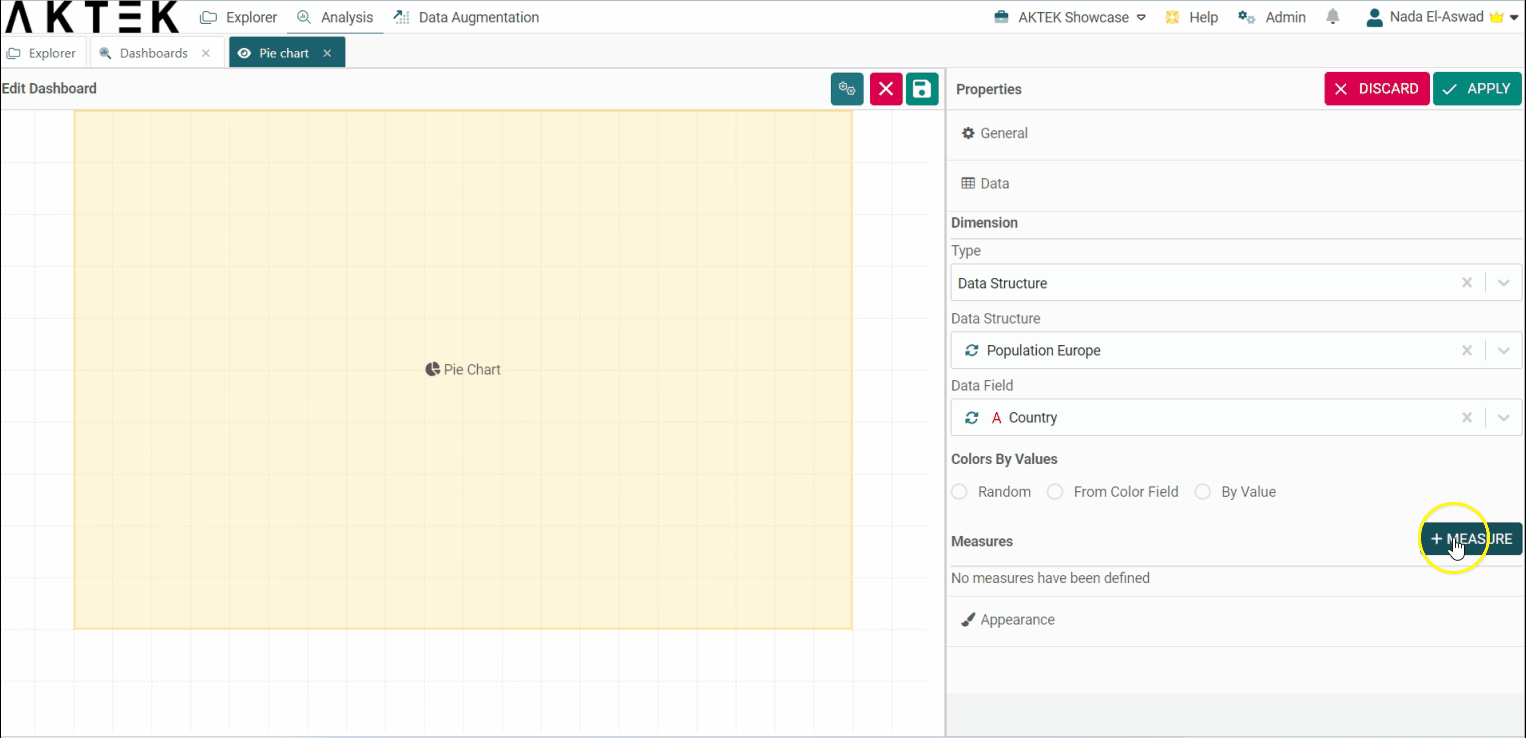
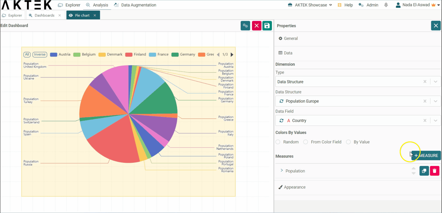
A Pie Chart in the AKTEK iO properties panel includes a general title, a dimension, and one (or more) measure. In this example, we will build a Pie Chart to show Europe’s population per country.
-
Select a Dimension. In order to divide your chart per Country, you will need to select Report Data instead of Time Series. You will also need an existing report to retrieve this data. In this case, we selected the Report “Population Europe” and a free text field called “Country”, now the data will be shown as a proportion for each unit entered in the field “Country”;
-
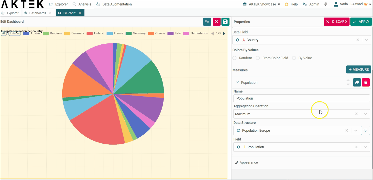
Now, let’s add a Measure by choosing a Title, Operation, Data Structure, and Field;
-
The report has just one data entry input per country. Because of this, the operation Maximum was selected, however, discover additional details regarding all the available aggregation operations here.
-
To edit, simply click Edit again on the top right and right-click over your pie chart;
-
Let's try to add a filter to the measure in order to exclude Poland and Italy from the chart. For this:
-
Expand the measure, and click on the filter icon next to the data structure;
-
Set the smart filter and click on Apply;
-
Save the changes.
-
-
Now that you have your Pie chart, save the dashboard and right-click on the chart to download it. It will save this chart as an image on your machine;
-
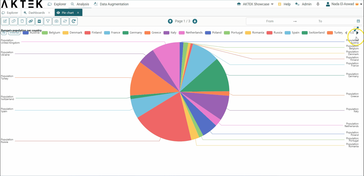
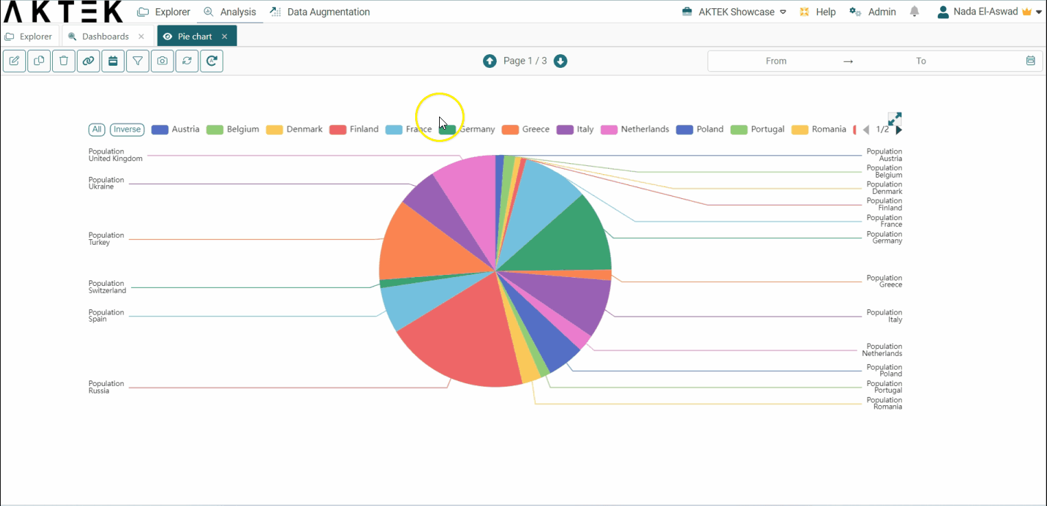
Click on any entry from the legend to show it or hide it from the Pie Chart. If you have 5 or more elements in the legend, two buttons will show next to it: All and Inverse:
- You can click on All to show all the legend elements on the chart, if not showing.
- You can click on Inverse to inverse the selection, i.e. to show the elements that were hidden and hide the elements that were shown on the chart.
- Let's try to add more than one measure in order to analyze the environmental incidents versus the number of population:
- Click on the + to add a new measure;
- Configure the measure based on your data. i.e. Count of the incidents. Discover additional details regarding all the available aggregation operations here.
- Click on Apply;
- Save - The labels will appear automatically to indicate the measure name and the legend.
⚠️ All data for different measures should be in one report.
💡 Hover over the chart to reveal the Full-screen icon in the top right corner of the chart. It will open in full screen for a better display during the presentation. Click on the x button to return to the standard view.
💡 Operations offer different ways to aggregate numbers or units:
- Sum: the sum of all the values in the specified field for that dimension.
- Count: total number of entries in the specified field for that dimension.
- Cumulative Sum: the total sum of all values cumulated over time (if the dimension is Time series) or cumulated based on the selected dimension (if it's a field in the data structure).
- Min: smallest value in the specified field for that dimension.
- Max: largest value from the specified field for that dimension.
- Avg: the average of the values in a specified column for that dimension.
- Last: a value from the last row of a sorted group. This means the last value entered for that dimension.
- Unique count: distinct values count of a specified field for that dimension.
Customizations on Dimensions
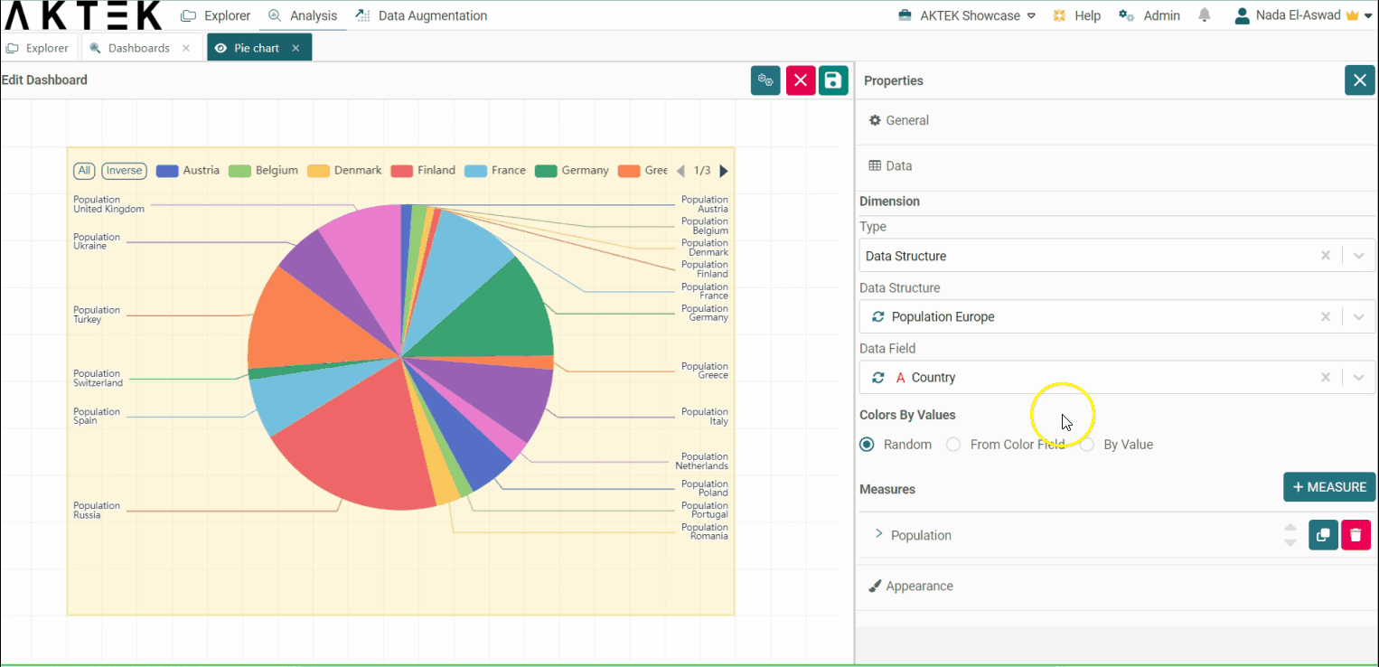
By default, AKTEK iO will choose random colors for the pie slices. However, you can change them using the Colors by Values options:
-
If you have colors already associated with each record, you can select From Color Field, then select the field where the colors are saved. You need also to set the default color.
-
Another way is to select By Value, and then define a specific color for each value. You need also to set the default color.
-
You can anytime select the Random option if you don't wish to set customized colors.
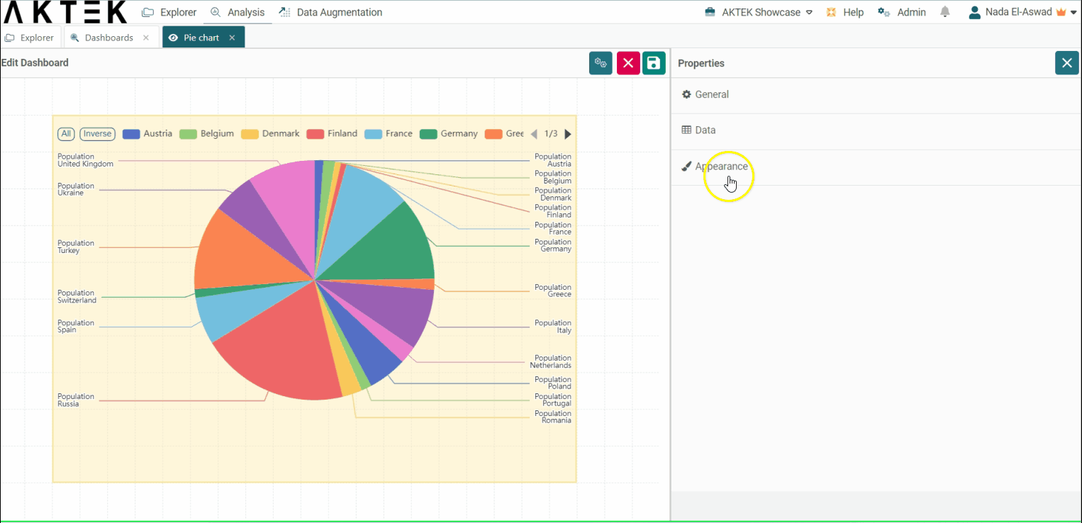
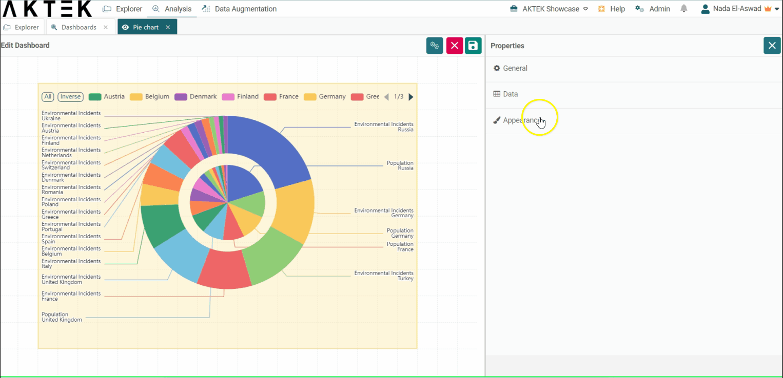
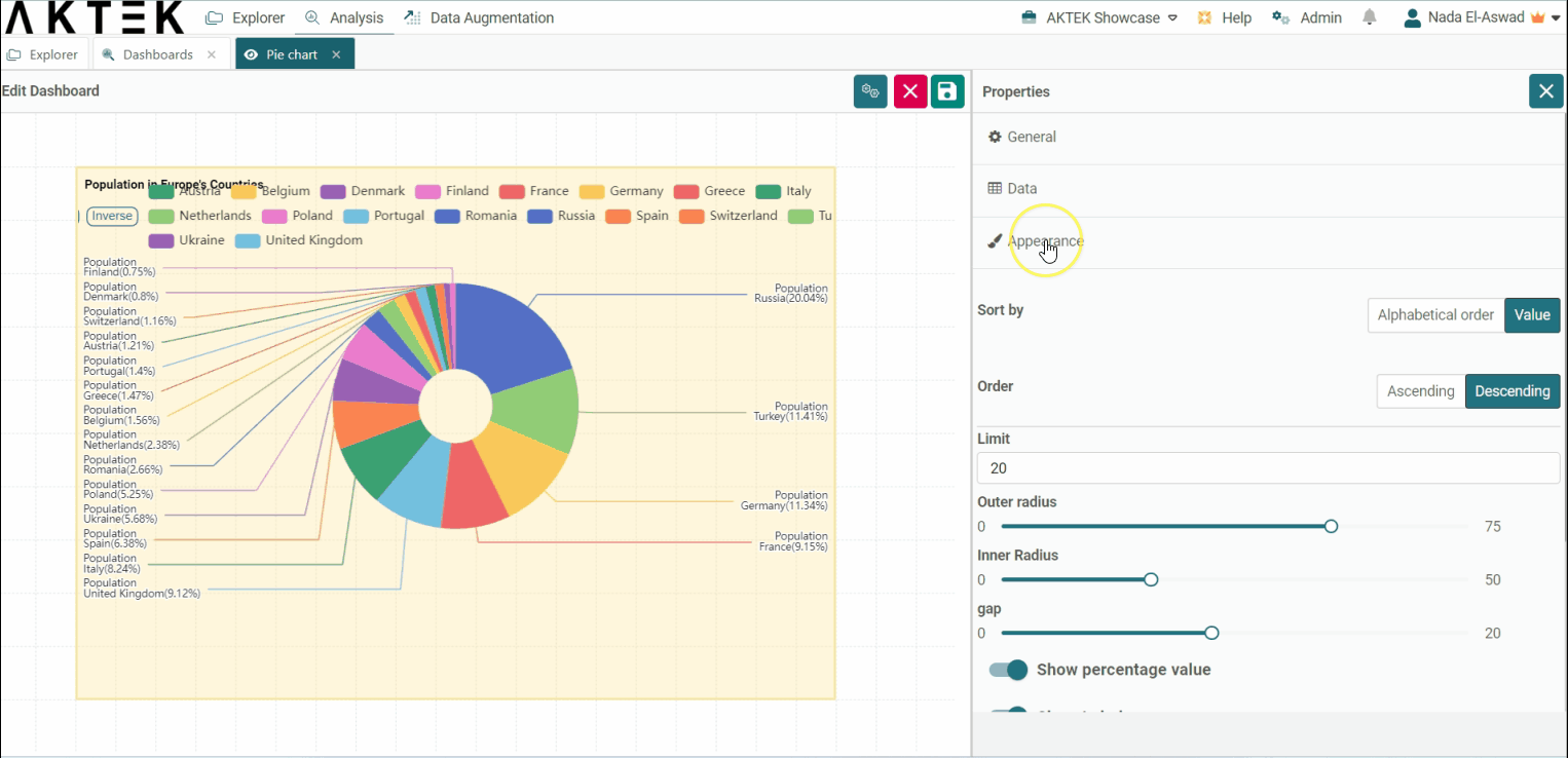
Appearance
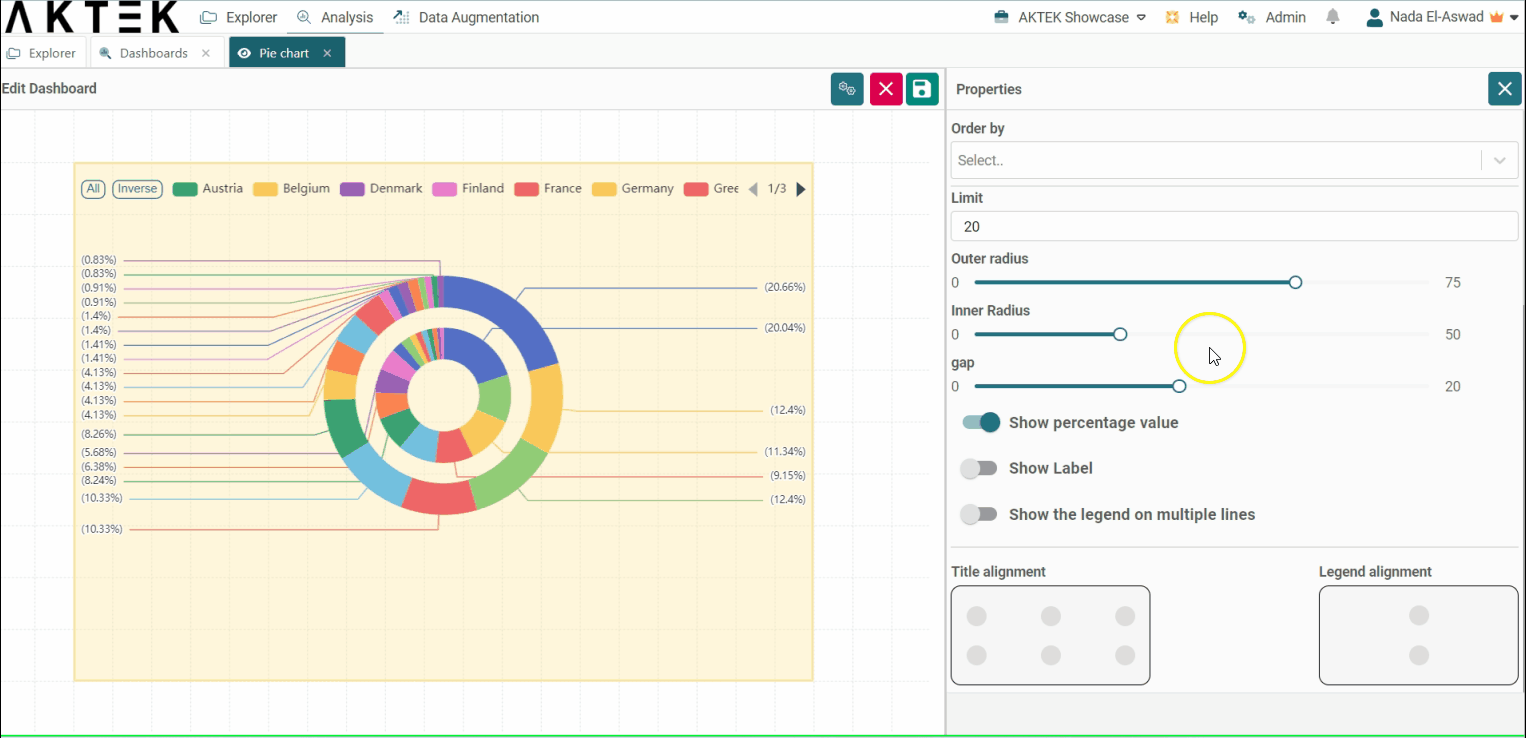
- Sort by: Will sort the dimension (x-axis):
- Alphabetically, or
- By Value: you will be asked to choose if you want the order to be Ascending or Descending, and which measure will define the order.
- Limit: After ordering the graph, you can add a limit for the information you need to see. In our example, if you order by value - ascending, then put a limit of 2: you will see the lowest 2 values (on 2 dates) only.
- Outer radius/Inner radius: Define the radius size with these values to see your chart in Pie shape or donut shape;
- Gap: When many measures are added, you can define here the size of the gap desired between the circles;
- Show percentage value in the legend: show/hide the percentage value in the legend.
- Show all legends on multi-lines: if disabled, the legend will show on one line and will be scrolling. If enabled, the legend will show on multiple lines instead of scrolling. Advised when downloading the pie chart as an image or sharing the dashboard as a PDF;
- Show labels: when enabled, the name of the slice will be displayed. If you are using more than one measure, the name of the measure+slide will be displayed. Advised when downloading the pie chart as an image or sharing the dashboard as a PDF.
- Title alignment: You can choose one of the six positions (top left, top center, top right, bottom left, bottom center, bottom right). Click on the bubble of the desired position;
- Legend alignment: You can choose one of the two positions (top middle or bottom middle). Click on the bubble of the desired position.
💡 Click on the link to know more about Actions on Dashboards Elements.