
Tree mapping is a data visualization technique used to display hierarchical data using nested rectangles
Table of contents
- When do you need a Treemap Chart?
- Add a Treemap Chart to your Dashboards
- Application Example
- Advanced Application Example
- Interacting with your Treemap Chart
- Design
- Appearance
When do you need a Treemap Chart?
The Treemap chart is used for representing hierarchical data in a tree-like structure. Data, organized as branches and sub-branches, is represented using rectangles. Each rectangle represents two numerical values, which can be visually analyzed by the size of the rectangle and the color.
If you answer yes to one or more of the use cases below, you probably need a Treemap chart.
-
Your data needs to be studied w.r.t two quantitative values.
-
You have a very large amount of hierarchical data and a space constraint.
-
You want a quick, high-level summary of the similarities and anomalies within one category as well as between multiple categories.
-
Your data can be organized at several levels.
Add a Treemap Chart to your Dashboards
Go to Analysis tab > Dashboards > Create/Edit a Dashboard
In this section, we will build a Treemap Chart and learn to interact with it.
In AKTEK iO follow the below steps to build a Treemap Chart.
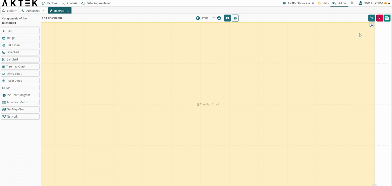
- Drag and drop the Treemap chart to your dashboard.
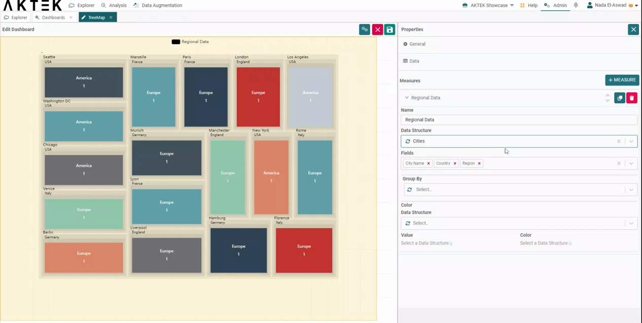
- Edit the chart to configure the properties.
- Add a title (optional).
- Add a Measure. Discover additional details regarding all the available aggregation operations here.
- Select the Data structure where your data is saved. Note that all levels of data should be present in the same data structure.
- Select the fields in the order you want to display them. The first selected field will represent the bigger square, the last selected field will represent the smallest square, and the label on the squares.
- Save
💡 Operations offer different ways to aggregate numbers or units:
- Sum: the sum of all the values in the specified field for that dimension.
- Count: total number of entries in the specified field for that dimension.
- Cumulative Sum: the total sum of all values cumulated over time (if the dimension is a Time series) or cumulated based on the selected dimension (if it's a field in the data structure).
- Min: smallest value in the specified field for that dimension.
- Max: largest value from the specified field for that dimension.
- Avg: the average of the values in a specified column for that dimension.
- Last: a value from the last row of a sorted group. This means the last value entered for that dimension.
- Unique count: distinct values count of a specified field for that dimension.
Application Example
In this example, we will see the data in 3 levels (Region - Country - City).
- In your data structure, you can add records for countries (adding country name as reference field) and add the region (America, Europe) as a reference field.
- In the Treemap, select this data structure, and add the fields in the following order: Region, Country, and City.
- You will get big squares for the regions, divided into smaller squares for the countries, and the last level of squares for the city with the city name showing on it (and the value related to this city).
- The square will represent the value associated (or the count - i.e. number of countries/cities).
- Regions will also be differentiated by colors. The countries and cities of the region will follow different shades of this color.
Advanced Application Example
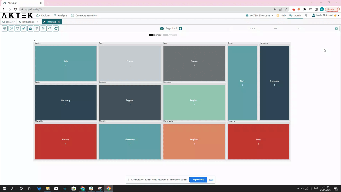
Other advanced features are Group by and Color.
- Under Group by, you can separate your data sets with one field of your data structure. For example, select Region as a "Group By" field, and you will get each Region separately. You can also switch between them in the legend of the chart.
- If you have specific colors associated with a certain field, you can also select the data structure and the field where the colors are saved. Keep in mind that the selected value has to correspond to the first selected field.
- In the Countries data structure, add a color to each country.
- Then in the settings of the Treemap, under Color, select Countries as the data structure.
- Value: the country name field.
- Color: the color field.
Interacting with your Treemap Chart
After saving your Treemap, you can interact with it by:
- Hovering over a rectangle to see the value it represents and the path (all levels) it belongs to.
- Click on the legend to switch between data sets.
- Click on a rectangle to zoom in/focus on it.
- You can also zoom in or zoom out your Treemap using the mouse scroll.
- Other functions of dashboard elements are also available: show in full screen and download as an image.
- From the legend: click on any entry to show it on the Treemap Chart.
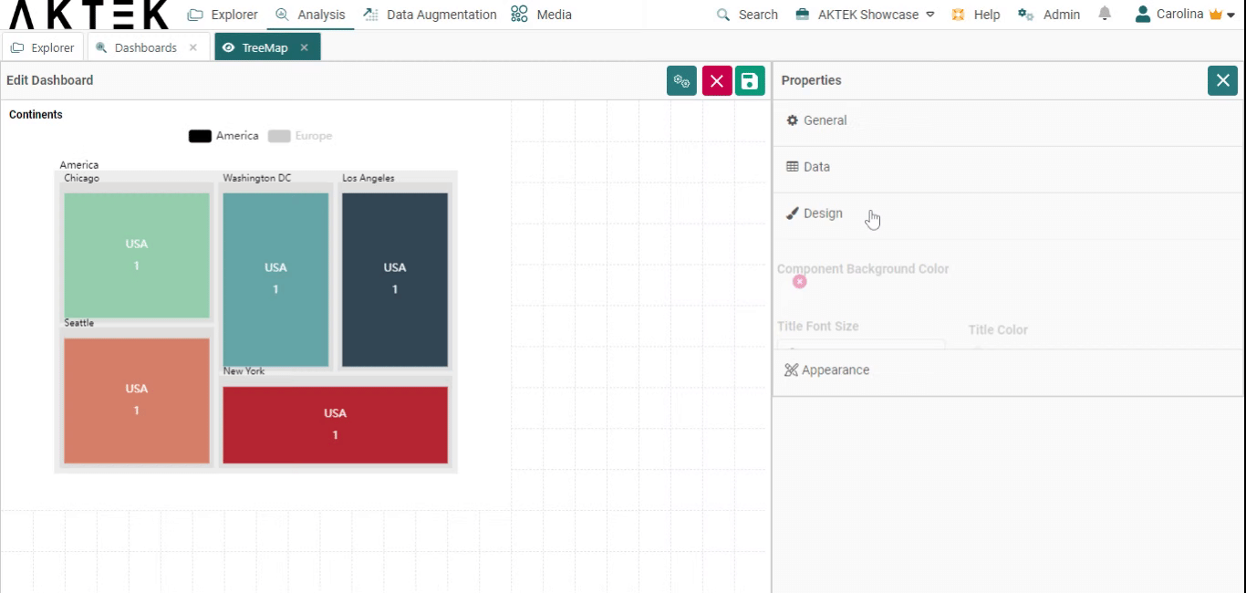
Design
- Component background color: Leave it unselected if you want a white background. You can also set the default color from the Company settings > Branding theme > Charts Background Color
- Title font size and Title color: Edit the default size (12) and the default color (black)
- Title alignment: You can choose one of the six positions (top left, top center, top right, bottom left, bottom center, bottom right). Click on the bubble of the desired position.
- Measures: Customize the font size and color of the elements on the legend.
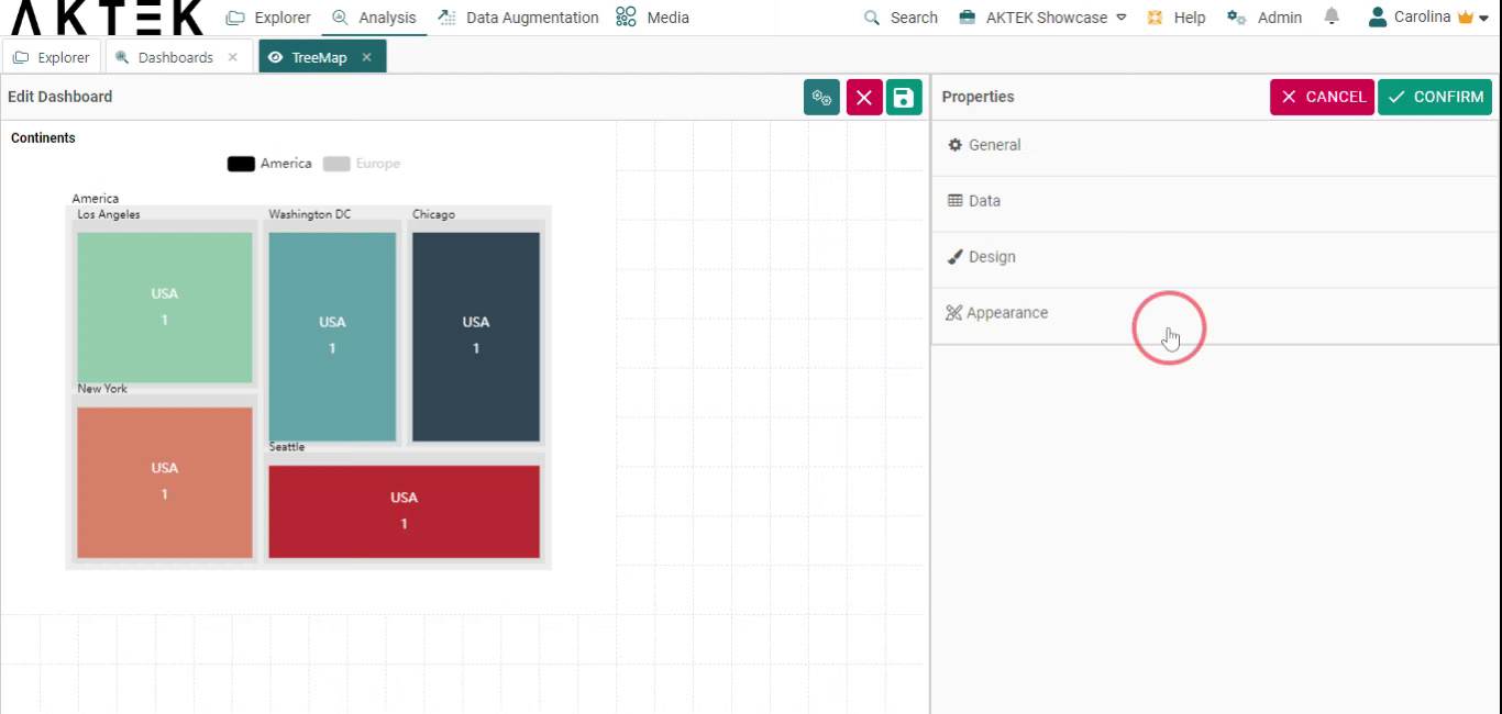
Appearance
- Sort legend by: Will sort the legend on top alphabetically or by value. You can then choose if you want the order (Order legend by) ascending or descending.
💡 Click on the link to learn more about Actions on Dashboards Elements.